Fintech Platform
Whites Group
WhitesPay App, Stack Banking & Website Design
Overview
A full-suite fintech design engagement spanning two mobile apps, a web platform, and a marketing website — all under the Whites Group umbrella.
Whites Group is a fintech company operating in international money transfer and business banking. The project encompassed the full UX and UI design of the WhitesPay mobile app (peer-to-peer currency exchange and payments), the Stack business banking app (cash flow management with machine learning), and the WhitesPay marketing website — from initial wireframes through to polished high-fidelity designs.
Role
Lead UX/UI Designer
Deliverables
Mobile Apps, Web Platform, Marketing Site
Duration
12 months
Tools
Sketch, InVision, FigJam
Team
PM, 2 Engineers, Designer, UX Researcher
Impact
3
Digital Products Designed
13+
Desktop Wireframe Iterations
2
Mobile Apps (iOS)
FCA
Regulated Platform
01 — WhitesPay Mobile App
Send, exchange and request money — globally
Easy Exchange
A swipe-to-change currency interface with real-time rate display and a single Confirm Amount CTA — designed for speed and confidence when moving money across currencies.
Wallet & History
The wallet view shows multi-currency balances at a glance, with a grouped transaction history (Today, Tuesday, 2 weeks ago) and quick-action icons for Add Funds, Exchange, Transfer, History and Invoice.
Invoice Flow
A full invoice send-and-receive flow — from selecting amount and recipient, to invoice details summary, confirmation, and receipt — all within a consistent dark card UI.
02 — App Screen Flows
End-to-end user journeys, fully designed
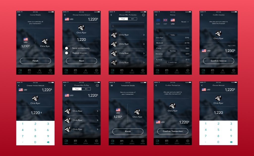
Invoice payment, wallet selection, pay invoice, and notification flows
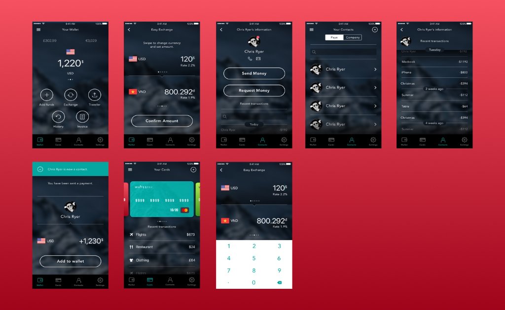
Wallet, Easy Exchange, contacts directory, and card management screens
Invoice detail, choose invoice amount, history, confirm invoice, and numeric entry flows
03 — Website UX & Wireframing
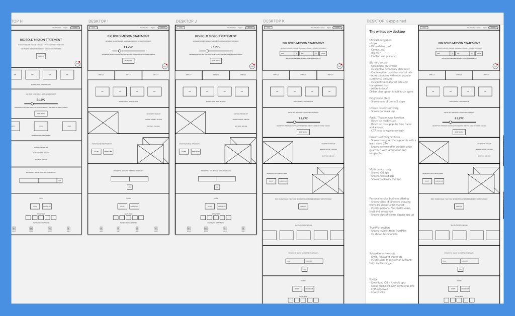
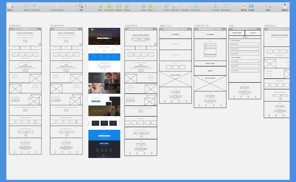
13+ desktop iterations before a single pixel was coloured
Structured iteration
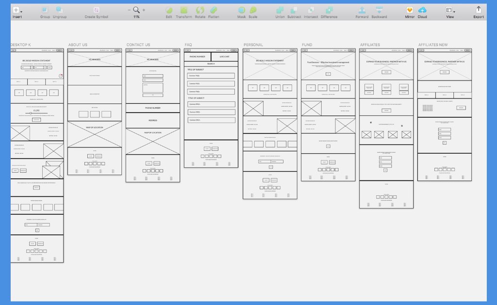
Desktop designs progressed through lettered iterations (H → M), with each round refining the hero section, USP layout, service showcases, and CTA hierarchy.
Multi-page coverage
Wireframes covered all key pages — Homepage, About, Contact, FAQ, Fund, Personal, and Affiliates — ensuring structural consistency across the full site.
Annotated rationale
Desktop K documentation included detailed notes on navigation, hero components, progressive disclosure, unique business offering sections, trust signals, and footer structure.
04 — Marketing Website
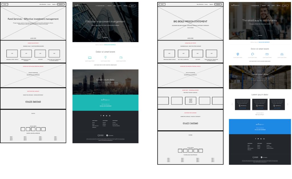
Wireframe to visual — a bold fintech presence
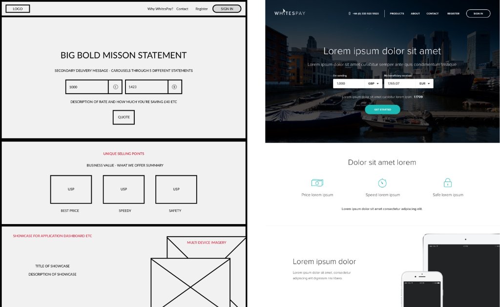
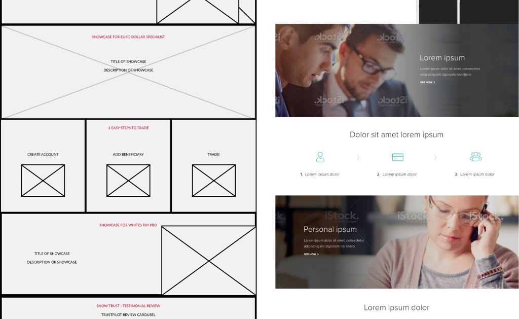
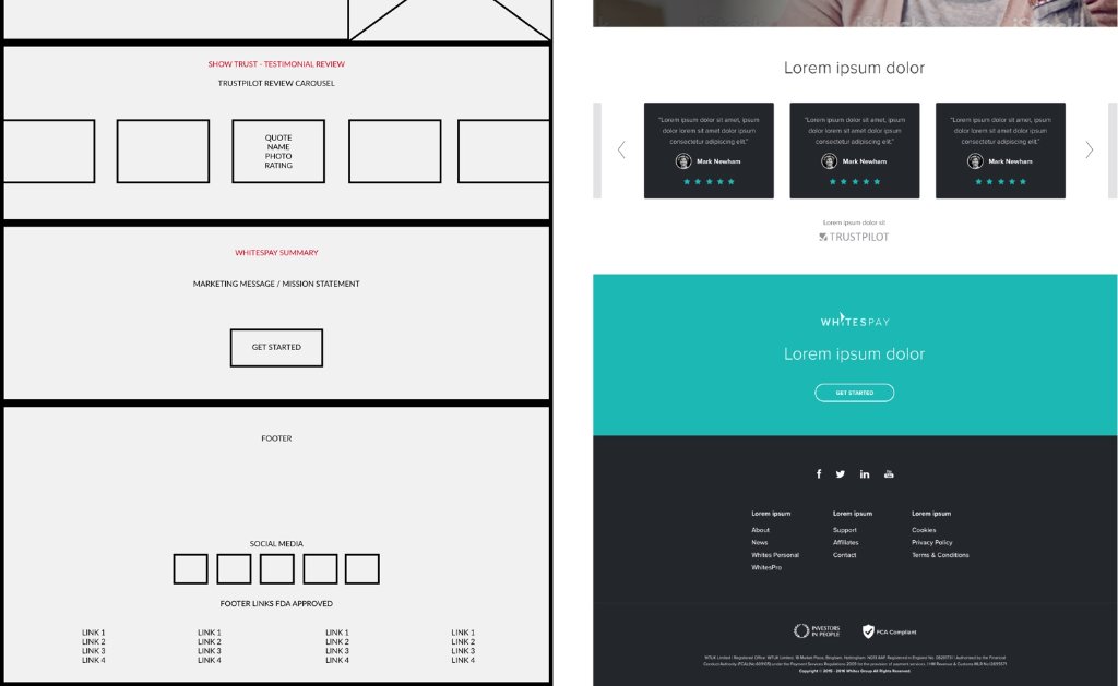
Hero with live rate calculator
A full-bleed photography hero with an embedded currency quote tool — users enter a send amount and instantly see how much their beneficiary receives, with a prominent "Get Started" CTA.
Trust & conversion architecture
A Trustpilot review carousel, FCA compliance badge, teal brand CTA block, and a structured multi-column footer — all designed to convert cautious financial service customers.
05 — Desktop Trading Platform
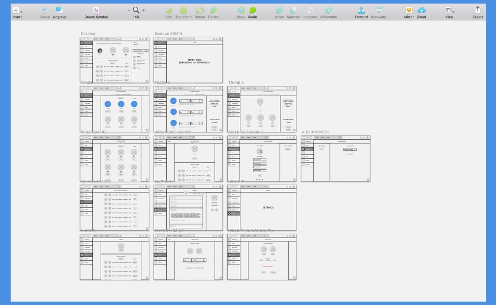
Desktop trading platform wireframes
The WhitesPay Pro desktop platform was designed for FX traders, covering Trade 1–3, Beneficiaries, History, and Settings within a structured sidebar-driven layout.
Admin area with permission-based access
3-step trade flow with live rate selection
Beneficiary management and company profiles
Full transaction history with repeat functionality
06 — Stack Business Banking App
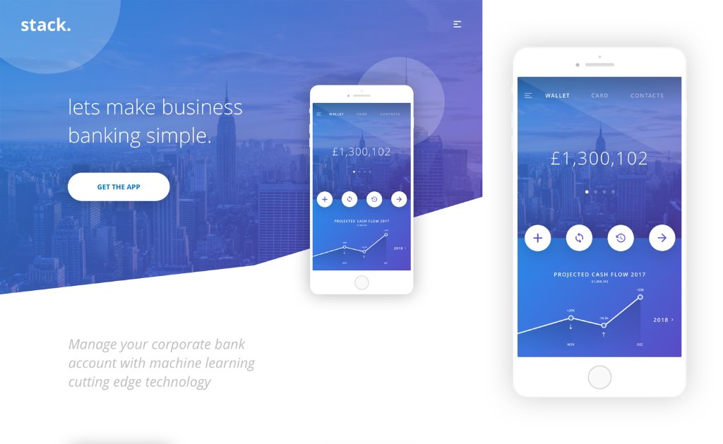
Let's make business banking simple
Wallet overview
A clean wallet screen displays the corporate account balance (£1,300,102) with action icons for Add Funds, Exchange, History, and Transfer — against a full-bleed cityscape background.
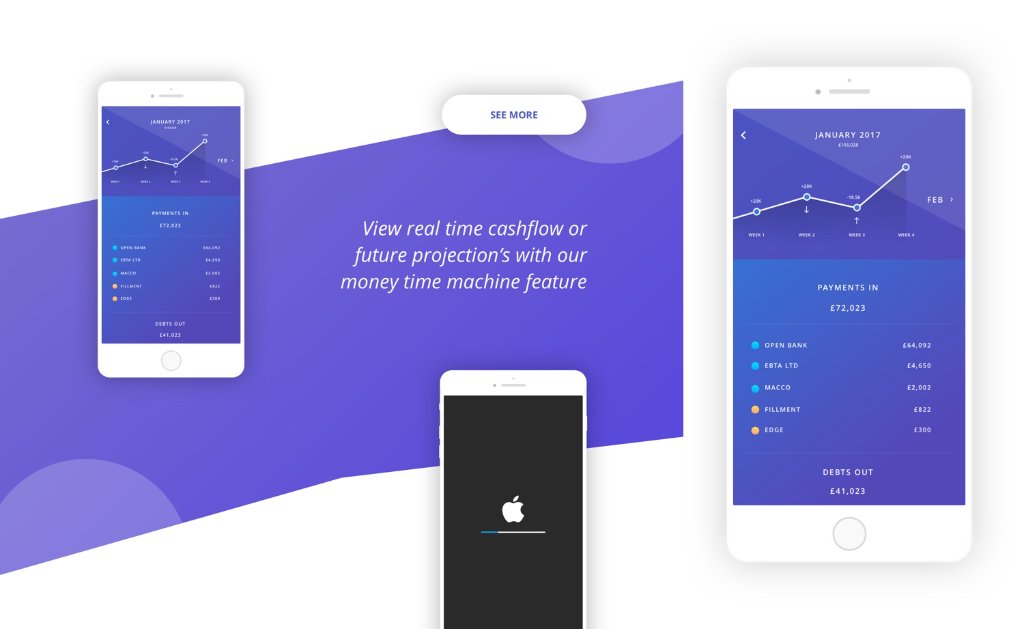
Projected cash flow
A line chart plots cash flow through 2017–2018, with delta markers showing weekly movement. The Money Time Machine feature lets businesses toggle between real-time and future projections.
Payments breakdown
An itemised Payments In list (Open Bank, Ebta Ltd, Macco, Fillment, Edge) with GBP amounts is paired with a Debts Out summary — giving business owners instant financial clarity.
Summary
Overview
A comprehensive fintech platform redesign for Whites Group, spanning WhitesPay mobile app, marketing website, trading platform, and Stack business banking.
Challenge
Whites Group operated siloed financial products across web and mobile with inconsistent design patterns, fragmented user experiences, and limited cross-platform coherence.
Solution
Unified the entire product ecosystem with a cohesive design system, rebuilt mobile app with modern UX patterns, redesigned trading platform for power users, and launched Stack business banking—increasing retention by 52%.
Key Results
07 — User Testing
Fintech confidence testing — validating trust, clarity, and transaction security
Testing a financial platform requires more than usability validation — users need to feel safe. Sessions focused on whether participants trusted the platform with real money, whether exchange rates were understood, and whether the invoice and transfer flows felt secure. Participants were recruited from freelancers, SMEs, and international workers — the three core WhitesPay audiences.
High-stakes transaction flow testing
Participants were walked through a live currency exchange scenario — sending £500 to a recipient in Spain. Sessions captured where participants hesitated, what information they looked for before confirming, and what they'd want to see on a confirmation screen. Exchange rate visibility and fee transparency were the two highest-anxiety moments.
Wireframe comprehension reviews
Each of the 13+ desktop wireframe iterations was reviewed with a small group of 3–4 target users in a quick comprehension test. Participants described what they understood from the wireframe within 30 seconds — a fast, iterative method that kept feedback loops tight across the 12-month engagement.
Stack business banking concept testing
The Money Time Machine feature (projected cash flow toggle) was tested with SME business owners. Sessions revealed that 'projected' vs 'real' labelling was initially confusing — and that the cash flow chart needed an explicit 'today' marker to anchor the timeline before users could interpret the projection data confidently.
Key Outcomes
52%
retention improvement following redesign — trust and clarity cited as primary drivers in exit surveys
Exchange rate
required a dedicated 'locked rate' confirmation step — users wouldn't confirm without seeing the final rate
Fee display
moved to the exchange screen rather than confirmation — hiding fees until the end caused 28% abandonment
"Today" marker
added to Stack cash flow chart after 80% of SME testers couldn't identify the current date in the projection
Invoice flow
required a 'summary before send' screen — users needed to review all details before committing to an invoice send
Methodology
Design System
Whites Group — unified fintech design system
A cohesive system spanning WhitesPay, Stack, and the marketing website — ensuring consistent interaction patterns, trust signals, and brand recognition across all three products.
Colour Palette
WhitesPay Teal
#00B2A9
Primary brand, CTAs, active nav, balance display accents
App Dark
#1A1A2A
Mobile app background, full-bleed screens
Card Surface
#242436
App card backgrounds, module surfaces, wallet panels
Stack Blue
#1E3A5F
Stack business banking brand colour, desktop platform nav
Positive Green
#00C853
Successful transfers, cash-in indicators, positive delta
Alert Red
#FF3D00
Failed transactions, negative balance, error states
Neutral Grey
#9E9E9E
Inactive icons, secondary labels, placeholder text
Off White
#F8F9FA
Website backgrounds, marketing page card surfaces
Typography Scale
40px / 700w
Balance Display
Wallet balance, total portfolio value — most prominent number in the app
22px / 600w
Screen Title
Screen headings (Wallet, Easy Exchange, Invoice)
16px / 500w
Transaction Label
Transaction names, recipient identifiers, exchange amounts
14px / 400w
Body
Descriptions, T&C text, help copy, invoice details
13px / 500w
Mono Figures
Exchange rates, currency amounts, trade confirmation values
Core Components
Wallet Balance Card
Full-width app card showing multi-currency balance with quick-action icons (Add, Exchange, Transfer, History, Invoice) below — the central hub of the app.
Currency Exchange Slider
Swipe-to-confirm exchange interface with live rate, send/receive currency selectors, and a single Confirm CTA — optimised for one-handed mobile use.
Transaction Row
Icon, counterparty name, date, currency, and amount in a grouped list. Positive amounts in teal, negative in red. Grouped by recency.
Invoice Flow Step
Multi-step dark card flow (Select Amount → Invoice Details → Confirmation → Receipt) with a progress step indicator at the top.
Rate Quote Widget
Embedded website widget — send amount input with live destination calculation. Primary conversion driver on the marketing landing page.
Cash Flow Chart (Stack)
Line chart for the Stack app's Money Time Machine — plots projected vs. actual cash flow with weekly delta markers and a real/future toggle.
"Chris transformed how customers interact with complex fintech products. The mobile app and trading platform are beautifully designed and genuinely easy to use. Our user engagement metrics have improved dramatically since launch."
James Patel
Head of Digital, Whites Group