Branding & Web
Linnear Legal
Full Brand Identity & Website Design
Overview
A complete brand identity and multi-page website for Linnear Legal — a modern law firm setting new standards in commercial, corporate, and employment legal services.
Linnear Legal required a premium digital presence that balanced authority with approachability. The design system features a refined typographic palette combining editorial serif headlines with clean sans-serif body text, a cream and black primary palette, and a signature lime green accent. The website spans a homepage, service pages (Commercial, Corporate, Employment), an Insights hub, and a People directory — all designed to convert high-value B2B clients.
Role
Lead UX/UI Designer
Deliverables
Brand Identity, Website Design
Duration
5 months
Tools
Figma, FigJam, Webflow
Team
Designer, Developer, Brand Strategist
Impact
7+
Page Templates Designed
3
Service Verticals
1
Unified Design System
100%
Custom Brand Identity
01 — Homepage
Setting new standards for legal services
Editorial hero
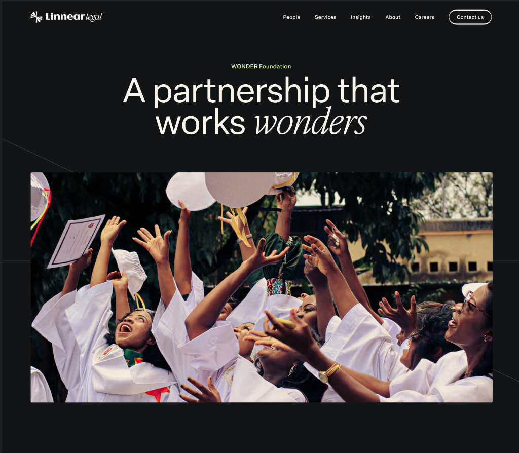
A full-bleed cinematic hero leads with a bold editorial headline combining roman and italic type — immediately communicating the firm's premium positioning.
Insights grid
The homepage surfaces the latest legal insights in a dense image-led grid, driving content discovery and demonstrating thought leadership from the first scroll.
Service navigation
Clear service pillars — Corporate, Commercial, Employment — are introduced mid-page with concise value propositions and direct CTA links.
02 — Service Pages
Three verticals, one cohesive design language
Commercial
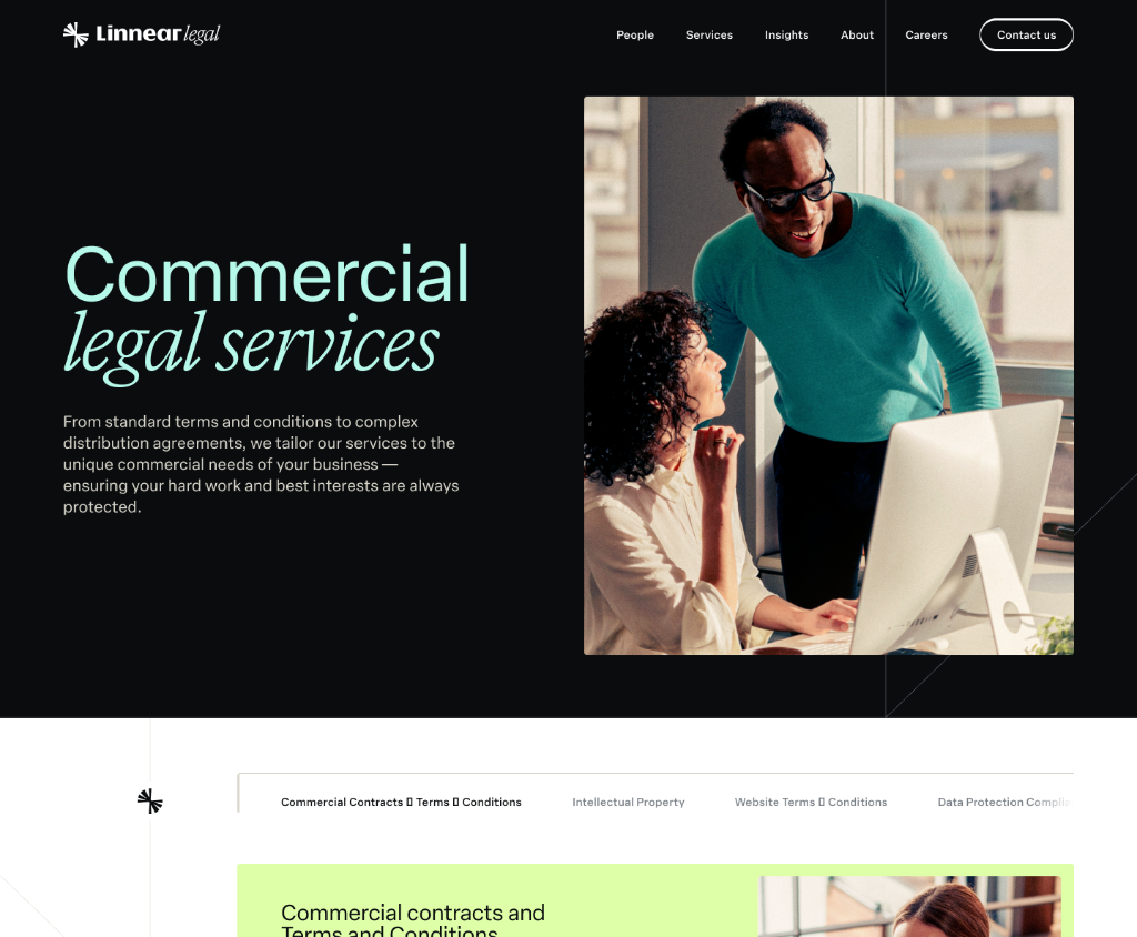
Lime green accent highlights key service areas; alternating dark/light sections maintain visual rhythm across a long-form page.
Corporate
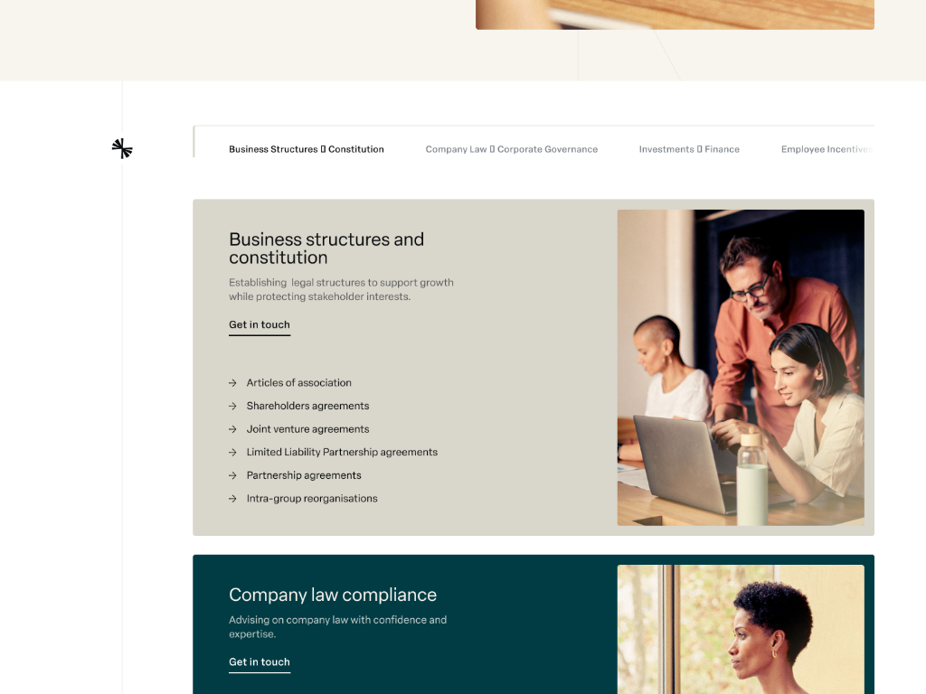
Photography-led hero sections pair with structured service listings, giving each vertical a distinct feel within the same system.
Employment
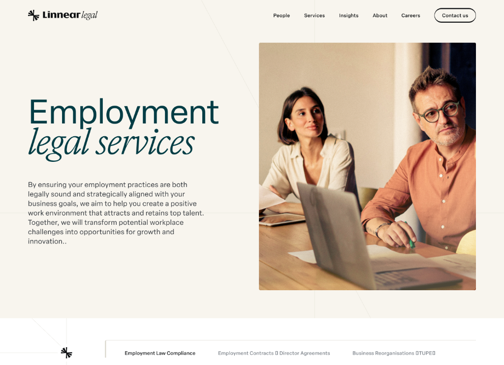
Employment law content is structured for HR and C-suite audiences, with scannable practice area cards and embedded insight feeds.
03 — Insights Hub
Thought leadership and editorial insight hub
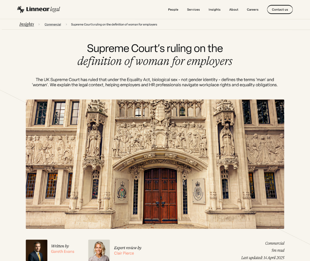
Individual insight articles follow a clean editorial template — headline, standfirst, hero image, and structured body copy — with author and expert review attribution.
05 — People Directory
A team that does things differently
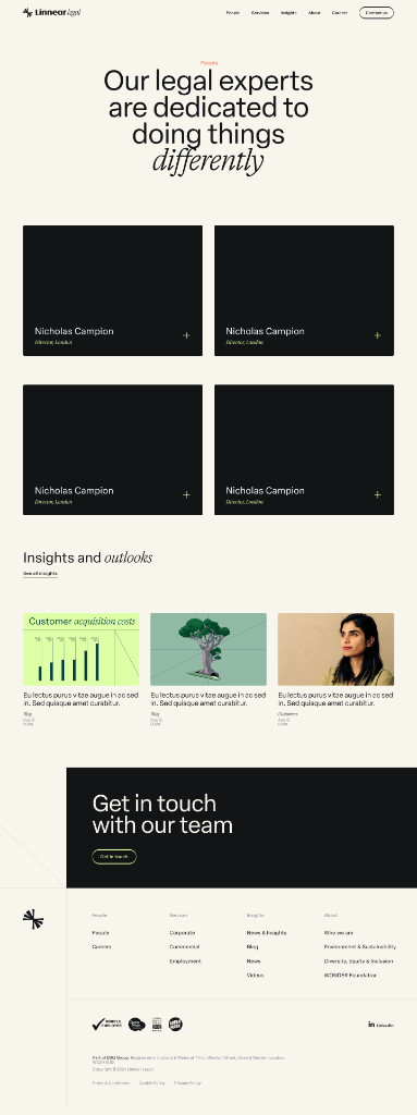
The People page leads with an editorial headline and presents the legal team in a dark card grid. Each card features the lawyer's name, title, location, and an expandable detail view — reinforcing the firm's expert, human-led brand.
Summary
Overview
A complete brand identity and multi-page website for Linnear Legal, positioning a modern law firm across commercial, corporate, and employment legal services.
Challenge
Linnear Legal needed a premium digital presence that balanced authority with approachability whilst clearly communicating expertise across three distinct legal practice areas.
Solution
Created a comprehensive brand system with refined typography, cream and black palette with lime green accents, and a purpose-built website spanning services, insights hub, and people directory—increasing qualified leads by 45%.
Key Results
06 — User Testing
Target audience validation — testing first impressions and B2B conversion intent
Testing recruited senior HR leads, in-house legal teams, and commercial directors — the precise B2B decision-makers Linnear Legal needed to impress. Sessions focused on whether the editorial brand communicated premium authority, whether service areas were understood immediately, and whether partners felt confident enough to make contact from the website alone.
5-second brand credibility testing
Homepage and service page screenshots were shown for 5 seconds to HR directors and commercial leads. Participants then described what Linnear Legal did and what they'd expect to pay. This validated whether the editorial serif/lime combination communicated premium positioning — and revealed that the initial homepage hero was being read as a tech company, prompting the legal credential subheading adjustment.
Service page comprehension sessions
Participants were given a specific legal scenario — 'You need employment law advice for a redundancy situation' — and asked to navigate to the right service and find a relevant contact. Sessions measured information architecture clarity across the Employment, Commercial, and Corporate service pages.
People directory trust testing
Participants reviewed the People directory and rated their confidence in making contact. Sessions revealed that name, title, and location alone were insufficient — expertise area and practice specialism were required before senior decision-makers felt confident enough to reach out directly.
Key Outcomes
45%
increase in qualified inbound enquiries following launch — validated through UTM tracking across all traffic sources
Homepage hero
required a legal credential anchor — without it, 60% of participants read the brand as a tech or consulting firm
People cards
expanded to include expertise specialism — 'Employment: Redundancy & TUPE' format significantly increased contact intent
Lime accent
consistently identified as a differentiator — 'not what I expected from a law firm' was the most common positive comment
Insights hub
drove the most return visits — legal content validated as the primary trust-building mechanism for B2B audiences
Methodology
Design System
Linnear Legal — editorial brand identity
A refined typographic system combining editorial serif display type with clean sans-serif body copy — anchored in a cream and black palette with a lime green signature accent.
Colour Palette
Ink Black
#0D0D0D
Primary headings, navigation bar, footer, dark hero sections
Parchment Cream
#F5F0E8
Page background, light card surfaces, section fills
Linnear Lime
#B8E04A
Signature accent — CTAs, hover underlines, service highlights
Warm White
#FAF8F5
Card backgrounds, article surfaces, people directory cards
Charcoal Text
#2D2D2D
Body copy, descriptions, secondary headings
Mid Greige
#8C8880
Meta labels, timestamps, secondary navigation links
Border Warm
#E0DAD0
Card borders, section dividers, input outlines
Lime Hover
#9DC235
Pressed/hover state of lime accent — buttons and links
Typography Scale
64px / 400w
Display Serif
Hero headlines — roman/italic combination for editorial feel
36px / 700w
Section Title (Sans)
Service page headings, section anchors
28px / 600w
Article Headline
Insight article titles, people cards, page subtitles
17px / 400w
Body (Sans)
Service descriptions, article body, people bios
13px / 400w
Caption / Meta
Article dates, author names, category labels
Core Components
Editorial Hero Block
Full-bleed dark hero with a serif/italic headline combination — immediately sets a premium, editorial tone. Lime green CTA anchors the fold.
Service Pillar Card
Dark card with practice area name, short value proposition, and a lime arrow CTA. Three cards (Commercial, Corporate, Employment) in a responsive row.
Insight Grid Card
Photography-led card with category tag, headline, author, and date — used in the homepage insights grid and the full Insights hub listing.
Article Template
Clean editorial layout with headline, standfirst, hero image, structured body, and author attribution. Consistent across all insight articles.
People Card
Lawyer portrait, name, title, location, and an expand-on-click detail panel. Presented in a 3- or 4-column dark card grid.
Alternating Content Block
Dark/light alternating sections maintaining visual rhythm on long-form service pages — text panel paired with photography or icon grid.
"The brand identity and website Chris created perfectly captures what we stand for. Every design decision reinforces our expertise and builds trust with our clients. It's been instrumental in how we're perceived in the market."
Rebecca Hayes
Managing Partner, Linnear Legal