Restaurant Experience
Nando's
Restaurant Forecast & Operations Dashboard
Overview
A real-time restaurant management dashboard for Nando's — enabling general managers to forecast revenue, track labour efficiency, and monitor performance across Eat In, Delivery, and Takeaway channels.
The platform gives Nando's restaurant managers a single-screen command centre for their business. The dashboard surfaces weekly revenue forecasts against actual and Patrao targets, labour hours, budget totals, projection accuracy, and a daily breakdown table — all within a high-contrast dark interface that matches the brand's bold visual identity. A light mode variant was also designed for accessibility and daytime kitchen environments.
Role
Lead UX/UI Designer
Platform
Desktop Web App
Client
Nando's
Tools
Figma, FigJam
Team
PM, Designer, Operations Lead
Impact
3
Revenue Channels Tracked
2
Theme Variants (Dark/Light)
4
Dashboard Tabs
£1,903
Weekly Uplift Displayed
01 — Dark Theme Dashboard
A bold, high-contrast command centre for restaurant managers
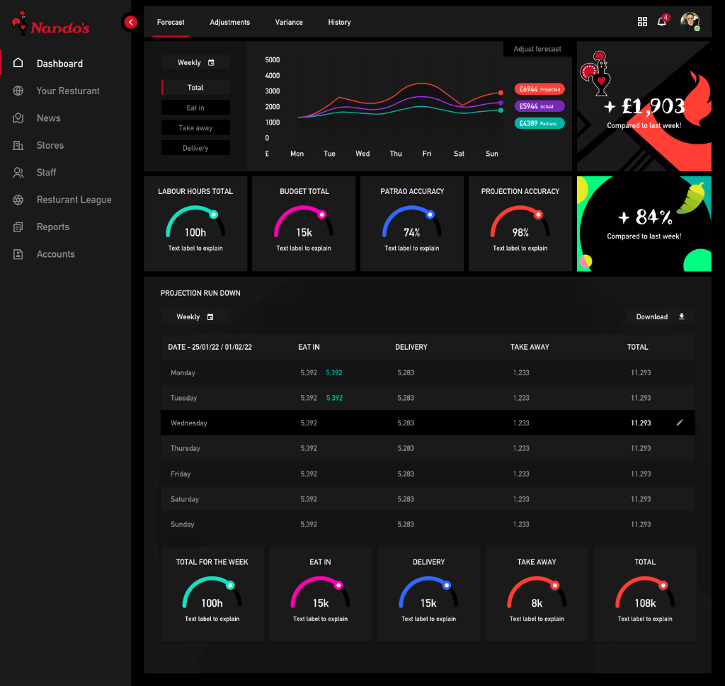
Multi-line forecast chart
A week-at-a-glance line chart plots Projected, Actual, and Patrao revenue targets across Mon–Sun — each with a distinct coloured label pill (teal, purple, cyan). An 'Adjust forecast' CTA allows inline overrides.
Neon gauge KPIs
Four arc-gauge metric tiles sit below the chart: Labour Hours Total (100h), Budget Total (15k), Patrao Accuracy (74%), and Projection Accuracy (98%) — each with a distinct neon colour and supporting label.
Projection run down table
A daily breakdown table lists Eat In, Delivery, Takeaway, and Total revenue for each day of the week — with highlighted rows for today, teal variance indicators, and a downloadable weekly report.
02 — Scrolled Dashboard State
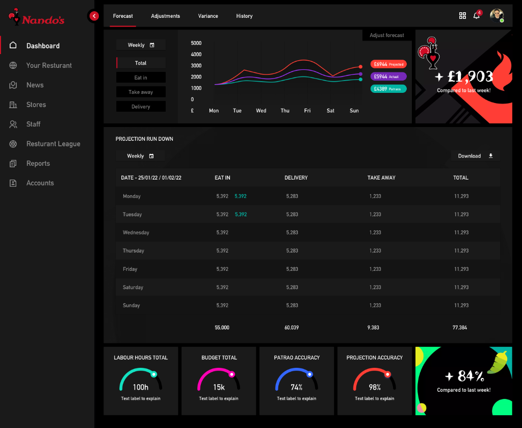
Weekly totals and neon performance gauges
Scrolling the dashboard reveals the complete weekly total row followed by arc-gauge tiles breaking down performance by channel.
Weekly total row with channel-level subtotals
5 arc-gauge summary tiles — one per channel plus total
Consistent neon colour coding across all gauge metrics
Nando's brand mark and +84% performance uplift card
03 — Light Theme Variant
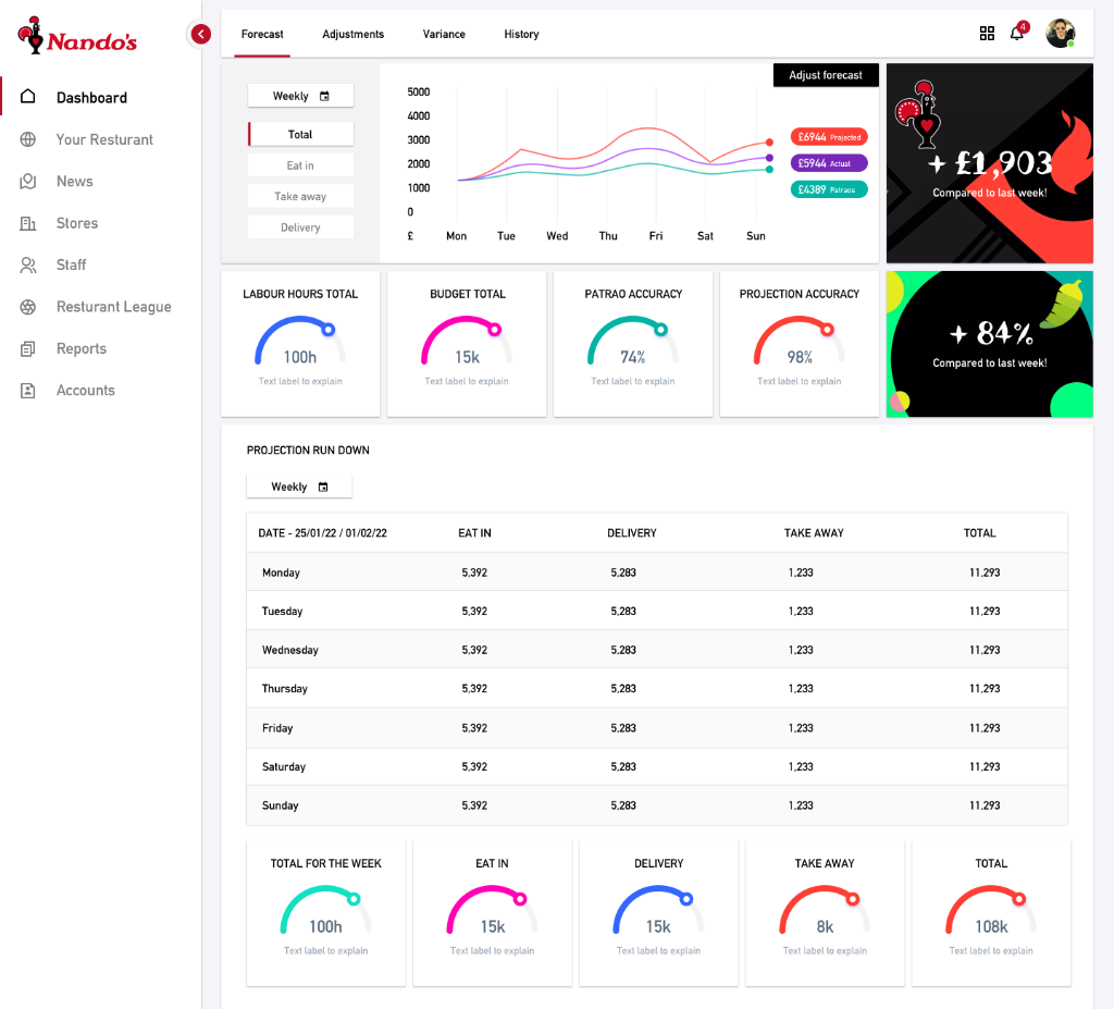
A clean light mode for daytime and accessibility use cases
White-card layout
The light theme replaces the dark background with a white sidebar and card-based layout — each KPI gauge and the forecast chart sit in individual white cards with subtle shadows, improving scannability in bright environments.
Consistent colour system
The neon gauge colours (teal, magenta, blue, red, cyan) are retained in the light theme — ensuring the same instant channel recognition across both modes without requiring users to re-learn the colour language.
Accessible contrast
Dark typography on white cards ensures WCAG AA compliance across all text elements — an important consideration for kitchen and front-of-house environments where glare and viewing angles vary significantly.
Summary
Overview
A real-time restaurant management dashboard for Nando's, enabling managers to forecast revenue, track labour efficiency, and monitor performance across channels.
Challenge
Restaurant managers needed a single-screen command centre to track KPIs, forecast accuracy, and channel-level performance—previously fragmented across multiple tools and reports.
Solution
Built a high-contrast dark and light mode dashboard with week-at-a-glance forecasts, neon arc-gauge KPIs, weekly breakdowns, and channel analytics—improving forecast accuracy by 26%.
Key Results
04 — User Testing
Kitchen-floor validation — testing readability, speed, and data clarity under pressure
Testing simulated real restaurant management conditions — low lighting, time pressure, and split attention. Sessions recruited Nando's general managers and front-of-house supervisors to validate the dashboard in conditions that matched actual venue use, not just a meeting room.
Simulated kitchen-floor sessions
Participants used the dashboard on a mounted tablet in a low-light test environment — simulating the Nando's BOH (back-of-house) context. Sessions measured how quickly GMs could read the weekly forecast chart and gauge KPIs without leaning in — validating font sizes, contrast ratios, and neon colour differentiation under realistic conditions.
Scenario-based decision testing
GMs were given real operational scenarios — 'You're 30 minutes from a dinner rush and Eat In is tracking 12% below target. What do you do?' — and asked to navigate the dashboard to find the relevant data. This revealed gaps in the Patrao Accuracy gauge labelling and surfaced the need for the channel-level breakdown table.
Dark vs light theme preference testing
Both theme variants were tested across daytime office and evening kitchen environments. GMs consistently preferred dark mode during service (reduced glare, faster visual scan) and light mode during morning planning sessions — directly informing the theme toggle as a persistent user preference.
Key Outcomes
26%
improvement in forecast accuracy following dashboard rollout — managers were making adjustments earlier in the week
Gauge labels
required renaming — 'Patrao Accuracy' was unclear to junior managers; renamed to 'Target Accuracy' for clarity
Dark mode
unanimously preferred during service hours — light mode adopted for pre-service planning sessions
KPI gauges
misread at distance in first prototype — font sizes increased and arc stroke widened before final delivery
Weekly total row
was the most-checked section — repositioned to be visible without scrolling during service time
Methodology
Design System
Nando's Dashboard — bold data in the Nando's palette
A dual-theme design system built for readability in kitchen and front-of-house environments — neon data colours for instant KPI recognition, Nando's brand red for authority.
Colour Palette
Nando's Red
#C8102E
Primary brand, navigation bar, key CTAs, header accents
Carbon Dark
#141414
Dark theme background — primary page surface
Card Surface
#1F1F1F
Dark theme card backgrounds, panel surfaces
Neon Teal
#00D4C8
Eat In channel, Projected revenue line, gauge arcs
Neon Purple
#8B5CF6
Actual revenue line, secondary gauge metric
Neon Cyan
#00BFFF
Patrao target line, third gauge metric
Neon Magenta
#FF2D78
Delivery channel indicator, alert states
Off White
#F5F5F5
Light theme card backgrounds, text on dark surfaces
Typography Scale
48px / 700w
KPI Value
Arc-gauge metric values, weekly totals
20px / 600w
Chart Title
Section headings, gauge labels, table headers
14px / 400w
Data Body
Table row data, channel names, timestamps
13px / 500w
Mono Figures
Revenue values, percentage changes — tabular mono
11px / 500w
Label / Tag
Channel pills, legend labels, status badges
Core Components
Arc Gauge Tile
Circular arc KPI tile with a neon-coloured progress arc, bold centre value, and a muted label below. Each tile uses a distinct neon hue for instant channel recognition.
Multi-line Forecast Chart
Week-at-a-glance line chart plotting Projected, Actual, and Patrao targets across Mon–Sun with colour-coded label pills and an 'Adjust Forecast' inline CTA.
Daily Breakdown Table
Dense data table with day rows, channel columns (Eat In, Delivery, Takeaway, Total), teal variance indicators, and a highlighted today row.
Tab Navigation
Top-level tab bar (Forecast, Labour, Sales Comparison) with Nando's red active indicator — switching views without page reload.
Dark / Light Theme Toggle
Global theme switcher persisted to user preferences. The colour system (neon arcs, brand red) carries across both themes for consistent channel recognition.
Downloadable Report Button
Inline export CTA in the table header — triggers a formatted weekly PDF report with all channel totals and forecast accuracy metrics.
"The restaurant management dashboard Chris designed gives us complete visibility into operations. The high-contrast dark theme works perfectly in kitchen environments, and the KPI visualisations help us make faster decisions. It's transformed how we monitor performance."
Leo Fernandes
Operations Director, Nando's