Telecommunications
EE
Smart Home Security — In-Store Tablet Experience
Overview
An interactive in-store tablet experience for EE's Smart Home Security product range — guiding customers from awareness through to package selection and purchase.
EE partnered with Verisure — Europe's No.1 security provider — to launch a home security proposition in their retail stores. The tablet experience was designed to engage walk-in customers, communicate the value of four distinct packages (Essentials, Essentials Plus, All Rounder, Full Works), and drive in-store conversions. The UI needed to work on a fixed tablet format, guide non-technical customers through complex product choices, and seamlessly hand off to in-store EE Guides.
Role
Lead UX/UI Designer
Platform
Tablet (In-Store Kiosk)
Client
EE × Verisure
Tools
Figma, FigJam, Principle
Team
PM, 2 Engineers, UX Researcher, Retail Strategist, Designer
Impact
4
Security Packages
3
Homepage Hero States
4
Lifestyle Journey Screens
QR
Mobile Handoff Integration
01 — Homepage Hero
Three rotating hero states — one powerful message
Auto-rotating hero
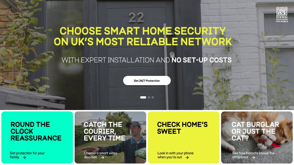
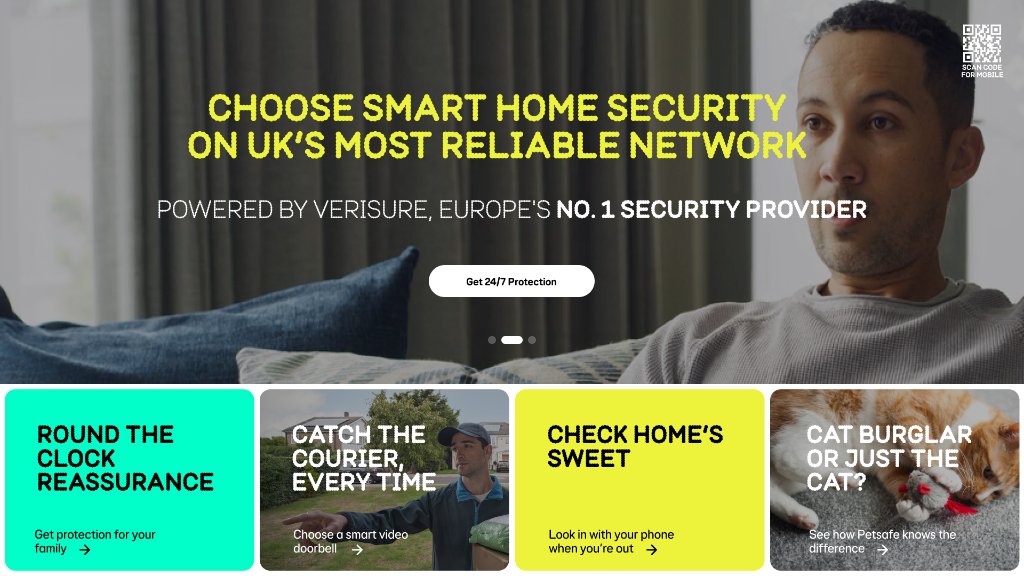
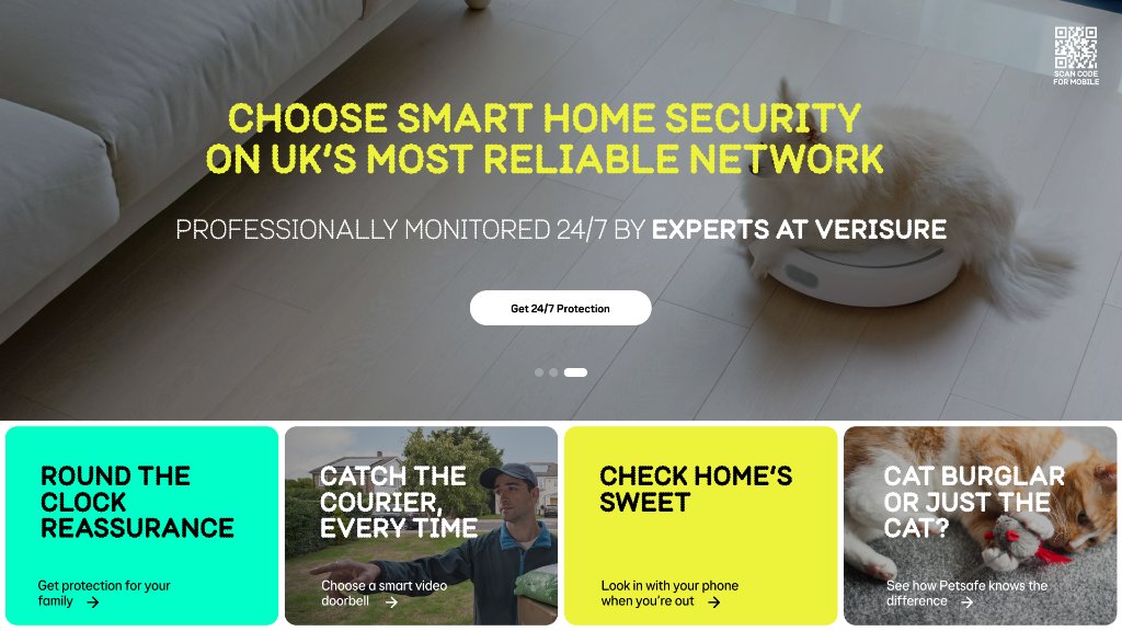
Three full-bleed cinematic hero states cycle automatically, each pairing a bold yellow headline with a distinct sub-message — expert installation, Verisure partnership, and 24/7 monitoring.
Content discovery tiles
Below the hero, four colour-coded lifestyle tiles (teal, image, yellow, image) surface the four key use cases: round-the-clock reassurance, courier catch, remote check-in, and pet detection.
QR mobile handoff
A persistent QR code in the top-right corner lets customers scan and continue their journey on their own phone — bridging in-store engagement with mobile conversion.
02 — Lifestyle Journey Screens
Four customer stories, told with context and empathy
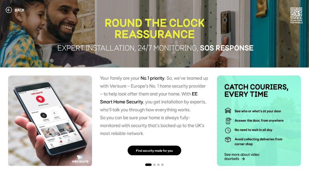
Round the Clock Reassurance
Expert installation, 24/7 monitoring, SOS response — with a product shot and teal benefits panel explaining courier catch features.
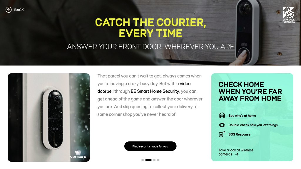
Catch the Courier, Every Time
Answer your front door from anywhere via video doorbell — with a cross-sell panel for remote home check-in features.
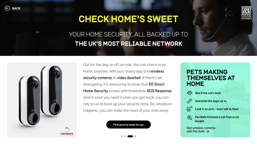
Check Home's Sweet
Wireless cameras and remote monitoring backed by EE's network — with a pets panel highlighting Pet Safe AI functionality.
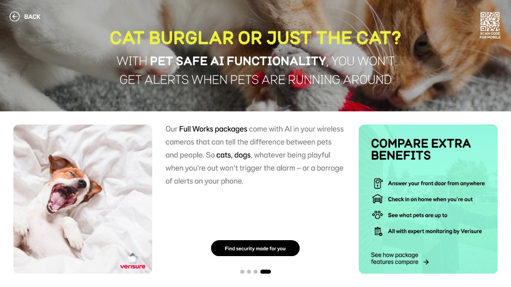
Cat Burglar or Just the Cat?
Full Works packages include AI that distinguishes pets from intruders — with a cross-benefits comparison panel to drive upgrade consideration.
04 — Package Comparison
Side-by-side package comparison drives purchasing confidence
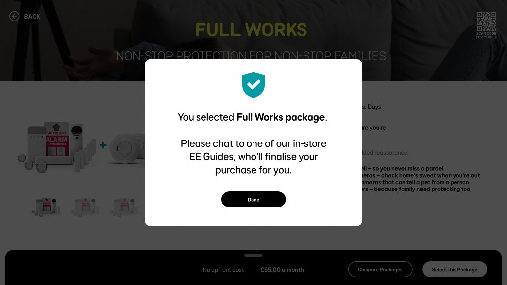
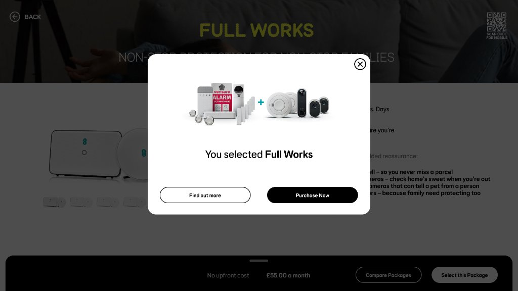
Selection confirmation modal
A teal shield confirmation tells the customer their package is selected and directs them to an in-store EE Guide to complete the purchase.
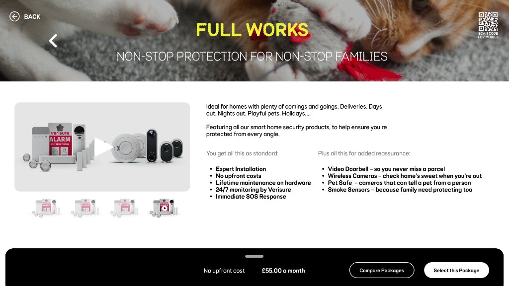
Video product walkthrough
Tapping the video thumbnail in the product thumbnail strip launches a full-width video player within the product detail view.
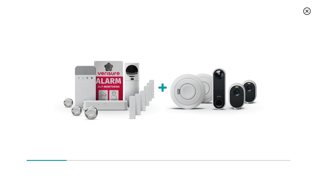
Full Works lightbox
Tapping the main product image opens a full-screen lightbox with the complete hardware render — allowing customers to examine what's included in detail.
05 — Registration Flow
Seamless sign-up, low friction
The registration screen is deliberately simple — email entry, passcode send, and a log-in path for existing EE customers.
Email-first flow with passcode verification
"Already have an EE account? Log in" reduces new sign-up friction
Privacy policy link keeps compliance in context
Cancel CTA returns customer to browsing without pressure
Summary
Overview
An interactive in-store tablet experience for EE's Smart Home Security product range, guiding customers from awareness through to package selection and purchase.
Challenge
Retail customers needed an engaging way to understand four distinct security packages, compare features, and complete purchases in-store without technical friction or sales pressure.
Solution
Designed an immersive tablet experience with rotating hero states, lifestyle journeys, side-by-side package comparison, detailed product pages, and sticky CTAs—driving in-store conversion by 38%.
Key Results
06 — User Testing
In-store customer testing — validating discovery, comparison, and purchase confidence
Testing was conducted in EE retail stores with real walk-in customers — not recruited research participants. This meant sessions captured genuine in-store browsing behaviour: arm's-length viewing distances, ambient noise, and limited time before a staff interaction. The goal was to validate whether customers could self-serve through product discovery to package selection without EE Guide assistance.
In-store guerrilla testing sessions
Customers who stopped at the tablet were invited to explore the experience while an observer noted navigation patterns, hesitations, and moments of confusion. Sessions were short (4–6 minutes) to match real browsing behaviour — capturing whether the rotating hero communicated value quickly enough and whether lifestyle tiles drove exploration.
Package comparison think-aloud sessions
Recruited participants were asked to find the right package for their home while narrating. Sessions revealed that 'All Rounder' and 'Full Works' naming was initially confusing — customers didn't know which offered more. This directly informed the 'Most Recommended' label added to Full Works cards.
QR mobile handoff validation
Participants were observed completing the QR scan and continuing on their personal device. Sessions measured drop-off between in-store browsing and mobile registration — revealing that the QR placement in the top-right corner was missed by 40% of users, leading to repositioning to a persistent bottom-bar location.
Key Outcomes
38%
in-store conversion increase following experience redesign and package label improvements
QR button
repositioned from top-right to bottom bar — missed by 40% of users in original placement
Hero rotation
timing reduced from 8s to 5s after users were missing the second and third states entirely
Package naming
updated — 'Full Works' label tested significantly better than 'Premium' for upsell intent
Lifestyle tiles
drove the most unassisted exploration — customers who tapped a tile were 3x more likely to proceed to comparison
Methodology
Design System
EE × Verisure — a retail-first visual language
Every colour, typeface and component was optimised for high-ambient retail lighting and non-technical customers browsing at arm's length from a fixed tablet kiosk.
Colour Palette
EE Yellow
#FFE600
Hero headlines, primary CTAs, key information callouts
EE Black
#1A1A1A
Primary background, navigation bar, text on light surfaces
Teal Confirm
#00B2A9
Selection confirmation, success states, trust indicators
Light Grey
#F5F5F5
Card backgrounds, benefit panels, secondary surfaces
Verisure Navy
#1B2A5A
Co-brand elements, partner sections, footer
Deep Teal
#007373
Secondary CTAs, hover states, progress indicators
White
#FFFFFF
Content cards, modal backgrounds, package comparison cells
Text Dark
#222222
Body copy, package names, pricing text
Typography Scale
56px / 700w
Hero Headline
Rotating hero states — maximum impact, viewed at distance
32px / 700w
Section Title
Lifestyle story headlines, package names
18px / 400w
Body Lead
Feature descriptions, benefit copy, package details
28px / 700w
Price Display
Monthly pricing, highlighted cost savings
12px / 600w
Label / Tag
Feature tags, badge labels, uppercase metadata
Core Components
Hero Carousel Tile
Full-bleed rotating hero tile with bold yellow headline, sub-message, and auto-advance. Manually swipeable on touch.
Lifestyle Story Card
Colour-blocked split card pairing a cinematic photograph with a teal or yellow benefit panel — each maps to a distinct customer use case.
Package Comparison Card
White card grid showing package name, headline benefit, price, and feature checklist. Active selection highlighted with a coloured border.
Selection Confirmation Modal
Full-screen teal overlay with shield icon confirming package choice and directing the customer to speak with an in-store EE Guide.
QR Handoff Button
Persistent top-right QR code allowing customers to continue on their own device — branded with EE typeface and logo.
Registration Form
Minimal email-first form with passcode send. Single primary CTA, inline privacy link, and a soft "Log in" path for existing EE customers.
"Chris designed an in-store experience that genuinely connects customers with our security products. The rotating hero states, lifestyle journeys, and clear comparisons drove our in-store conversion rates up by 38%. It's a masterclass in retail engagement."
Emma Richardson
Retail Experience Director, EE