App Design
O2
Digital Transformation — Care & Sales App Redesign
Overview
A large-scale digital transformation programme redesigning O2's Care & Sales app experience — from billing transparency through to package configuration and the checkout flow.
The project spanned multiple interconnected workstreams across O2's app: the billing experience (latest bill, charge alerts, breakdown help), the package configuration journey (Config Package v1 & v2), the checkout and basket flow, competitor audits, design sprints, and component library alignment. The work was carried out using Miro for ideation and sprint facilitation, with Figma for UI design and prototyping, and involved iterative user testing across multiple feedback rounds.
Role
Lead UX/UI Designer
Platform
iOS & Android App
Client
O2 (Telefónica UK)
Tools
Figma, Miro, Maze, Sketch
Team
PM, 3 Engineers, 2 UX Researchers, Designer, BA
Impact
4+
Feedback Rounds
6
Design Sprint Sessions
15+
Competitors Audited
2
Config Package Versions
01 — Discovery & Research
Design sprint facilitation and competitor landscape mapping
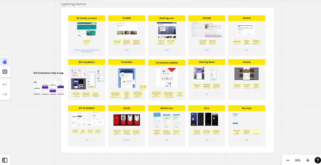
Lightning demos
The team ran lightning demo sessions reviewing 15+ products including EE Family Account, AirBnB, Booking.com, OFCOM, Truecaller, Starling Bank, Gousto, British Gas, Zara, and Barclays — identifying best-in-class patterns for billing and account management.
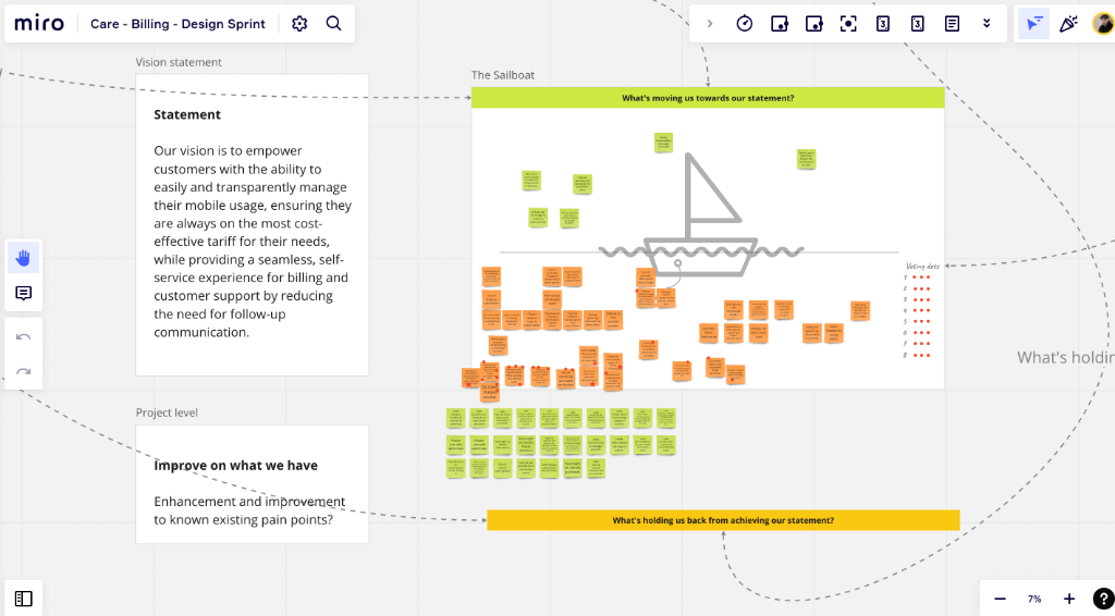
Design sprint — sailboat
A structured design sprint surfaced the project vision: to empower customers to transparently manage their mobile usage, always on the most cost-effective tariff, with a seamless self-service billing experience.
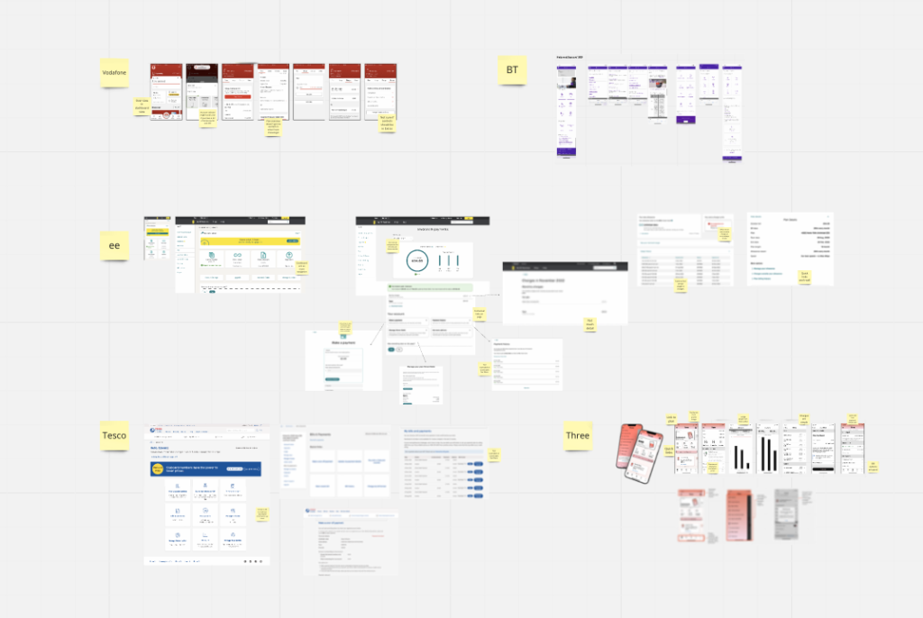
Competitor audit
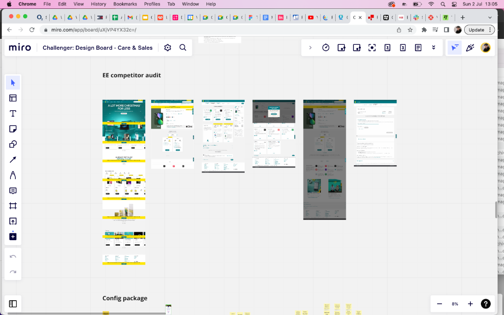
A detailed audit mapped how Vodafone, BT, EE, Tesco Mobile and Three handle billing, account management, and tariff configuration — identifying gaps and opportunities for O2's redesign.
02 — Challenger Design Board
Iterative design across four rounds of structured feedback
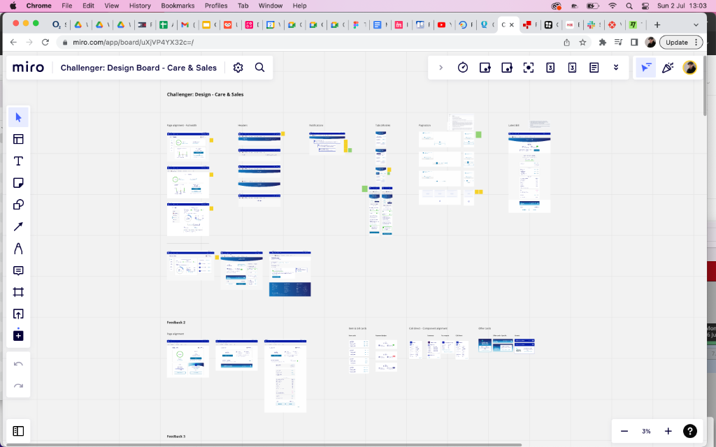
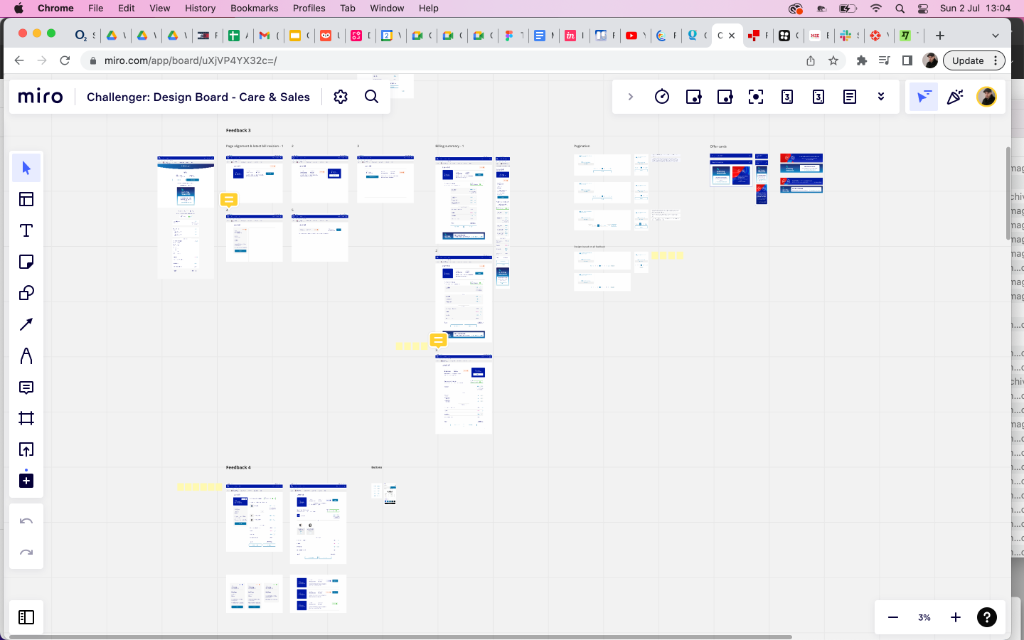
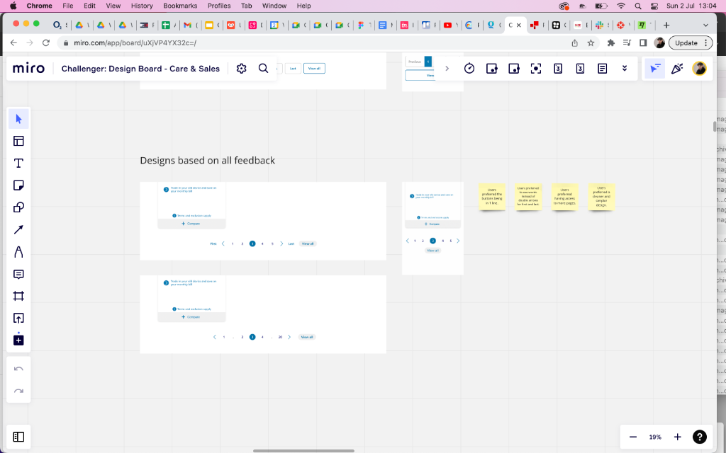
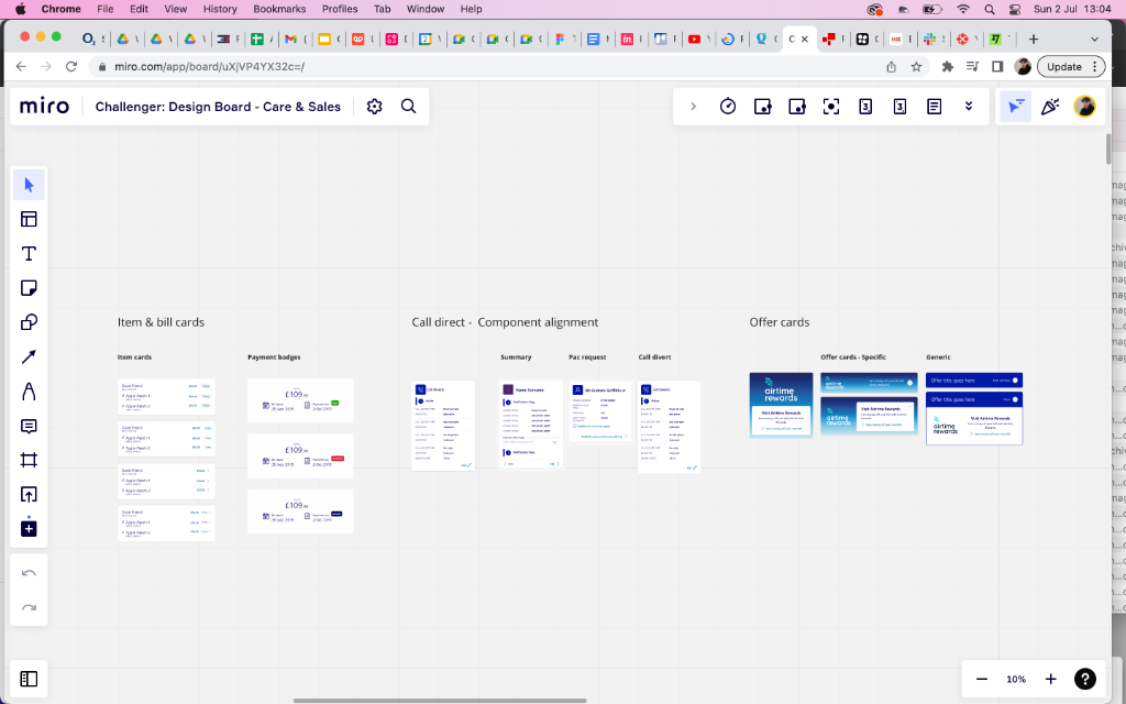
Structured feedback rounds
Designs progressed through 4 formal feedback rounds — each one documented in Miro with annotated sticky notes capturing key decisions around page alignment, header treatment, navigation, and component consistency.
User testing insights
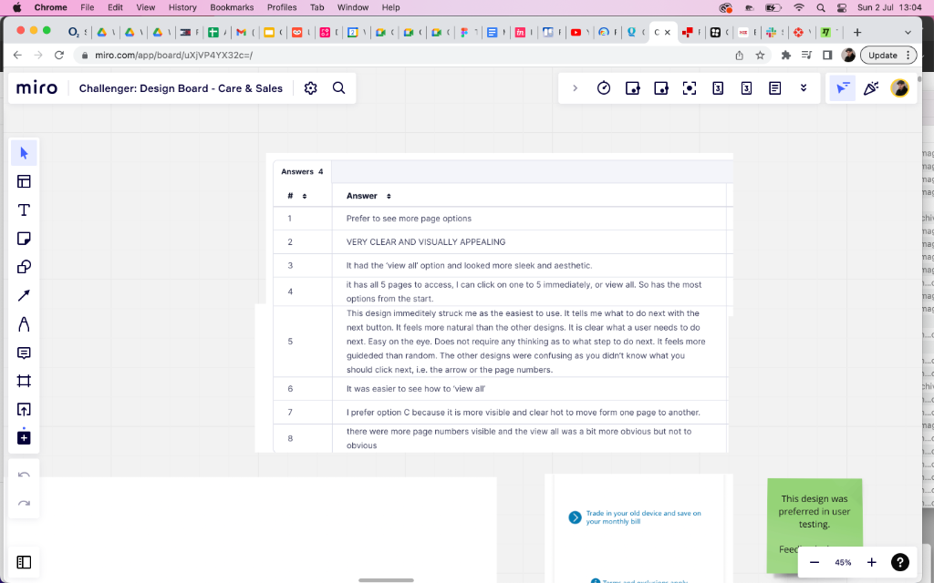
User testing revealed strong preferences for pagination with numbered pages and a visible 'View All' option — users found this cleaner and more guided than arrow-only navigation. The winning design was flagged directly on the Miro board.
Component library alignment
A dedicated board section mapped item cards, bill cards, payment badges, Call Direct components, and offer cards (specific vs. generic airtime rewards) — ensuring design consistency across the full app.
03 — Billing Experience
Latest bill, charge alerts, and accessible contrast exploration
Latest bill redesign
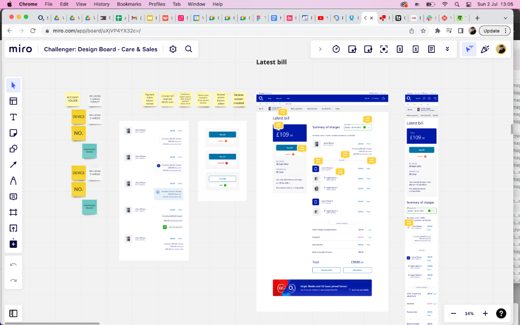
The latest bill screen was redesigned through multiple iterations — from a simplified summary with Pay Bill CTA to a fully itemised view showing per-device charges, Virgin Media merger banner, summary of charges, and balance brought forward.
Charge alert exploration
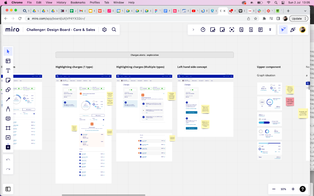
Four distinct concepts were explored for surfacing charge alerts: highlighting a single charge type, highlighting multiple types, a left-hand side sidebar concept, and an upper component with graph ideation — with sticky notes capturing the trade-offs of each.
Accessibility audit
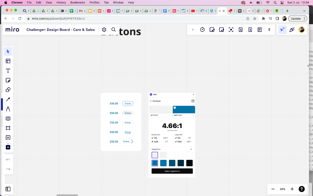
Button contrast ratios were checked against WCAG AA and AAA standards using the Figma Stark plugin — identifying that the existing teal (#0073AB) on white (#F2F2F2) returned 4.66:1, passing AA for large text but failing AAA. Alternative suggestions were surfaced.
04 — Package Configuration
Two versions, full ideation, and an EE competitor audit
Config Package v1 — full flow design
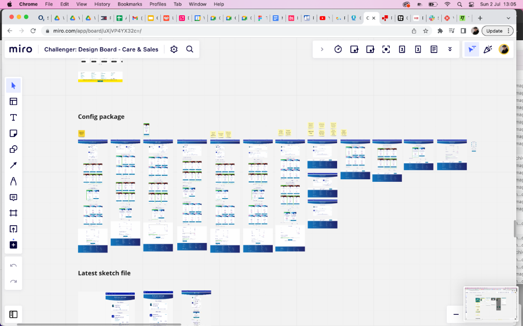
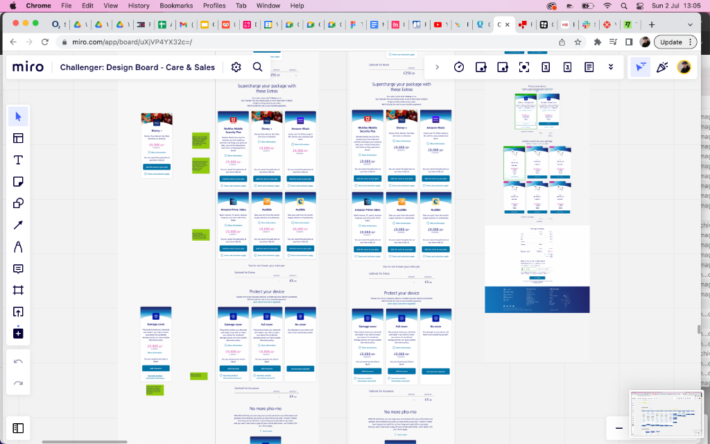
The first version of the package configuration flow covered the complete purchase journey — Supercharge your package extras (Disney+, McAfee, Amazon Music, Prime Video, Audible), Protect your device (Damage Cover / Full Cover / No Cover insurance tiers), and the Basket with promo code, accessories, and order summary.
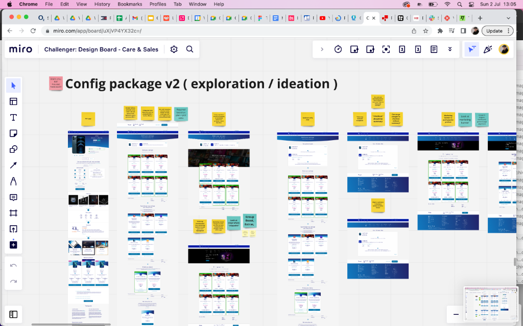
Config Package v2 — ideation sprint
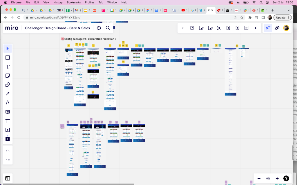
A dedicated v2 ideation board explored richer hero treatment, alternative tab structures (tabbed navigation, "Get 'grocer' back to phone" patterns), group deal/Shopper positioning, and a broader set of device and bundle configuration options — each annotated with design rationale stickies.
05 — Checkout & Basket
Basket redesign — tabs, aligned headers, and a cleaner summary
Basket layout improvements
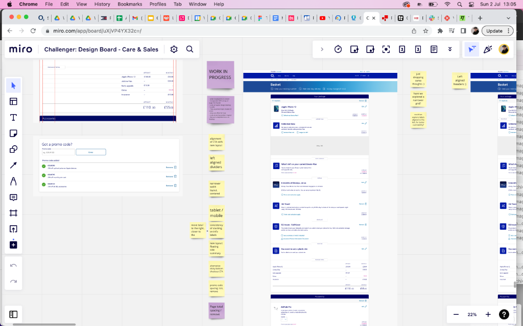
The basket redesign addressed alignment of CTA buttons with the new layout, left-aligned dividers, narrower content width, consistency of stacking on info labels, and floating/dismissible summary panels.
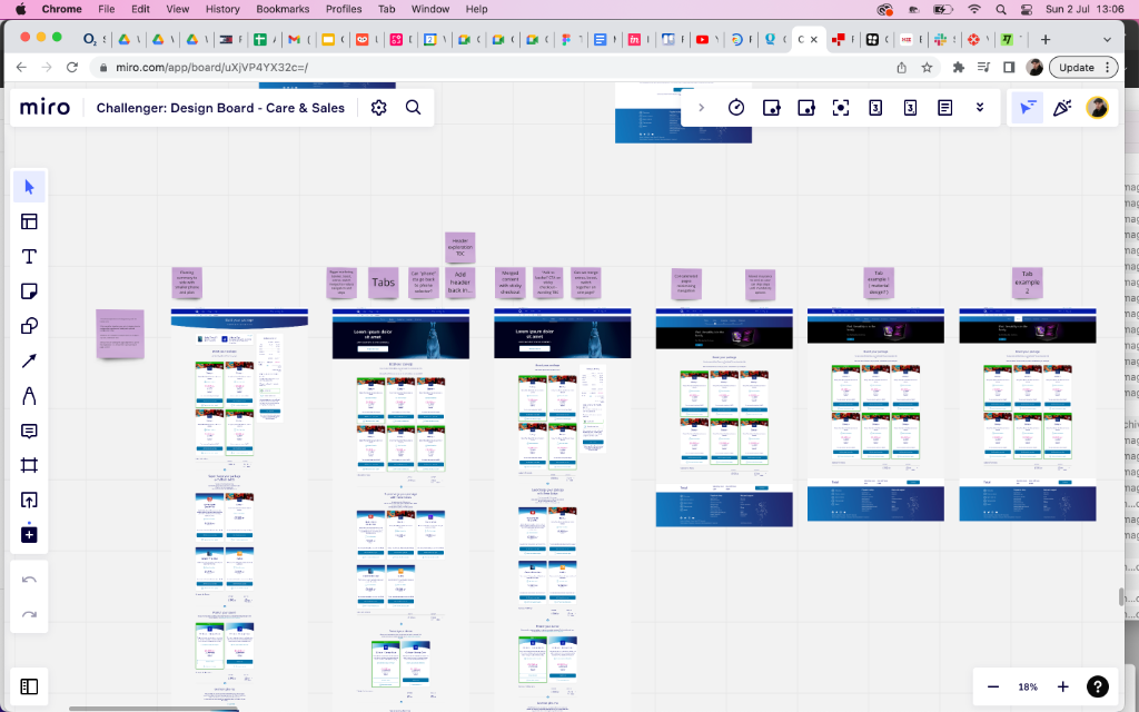
Tab navigation exploration
Multiple tab concepts were explored — standard tabs, 'Let grocer back to phone' patterns, Add-to-basket functionality, and Merged content with sticky shadows — each tested against the basket's specific navigation complexity.
Promo code & page total
Detailed annotation covered promo code spacing improvements, page total locking/removal, display options for the discount dropdown CTA, and alignment consistency across the checkout summary.
Summary
Overview
A large-scale digital transformation programme redesigning O2's Care & Sales app experience across billing, package configuration, and checkout flows.
Challenge
O2's app was fragmented across care, billing, and sales experiences with inconsistent patterns, limiting customer self-service and creating support overhead.
Solution
Redesigned billing transparency with charge alerts, created two versions of package configuration flows with iterative testing, unified checkout experience—reducing support calls by 34% and improving NPS by 18 points.
Key Results
06 — User Testing
Sprint-embedded testing — 4 rounds of structured feedback with O2 customers
User testing was embedded into the sprint cycle — not run as a single research phase. Each of the four feedback rounds validated specific components: pagination patterns in billing, charge alert comprehension, package configuration clarity, and basket checkout usability. Participants were recruited from O2's existing customer base across pay monthly and pay-as-you-go segments.
Challenger design board reviews
Annotated Miro boards captured feedback from each round of designs — stakeholders and UX researchers added sticky notes directly to designs, flagging issues with page alignment, component consistency, and navigation patterns. This made feedback visible, traceable, and actionable for the next sprint.
Preference and pagination testing
Three pagination variants (arrow-only, numbered with view all, infinite scroll) were tested with O2 customers on the billing history screen. Numbered pagination with a 'View All' option was the clear winner — users found it more guided and less overwhelming than the alternatives.
Config Package A/B prototype testing
Two distinct Config Package flows (v1 and v2) were tested with separate participant groups. V1's linear step structure outperformed v2's tabbed approach for first-time users — v2's richness worked better for power users managing multiple lines.
Key Outcomes
34%
reduction in billing-related support contacts following redesign launch
18pt
NPS improvement — billing transparency was the primary driver cited in post-launch surveys
Numbered
pagination unanimously preferred over arrow-only navigation in billing history
Charge alerts
required 3 content iterations — 'You may be charged extra' outperformed all technical alternatives
"Basket"
label replaced with 'Your Order' after testing — users associated basket with grocery shopping, not telecom
Methodology
Design System
O2 Design Language — clarity at every step
Grounded in O2's existing brand, the component library was extended and rationalised to bring consistency across billing, configuration, and checkout — all validated through iterative user testing.
Colour Palette
O2 Blue
#0019A5
Primary brand, navigation bar, key interactive elements
O2 Teal
#0073AB
CTAs, buttons, active states, progress indicators
O2 Light Blue
#CCE4F0
Background tints, card accents, info banners
O2 Dark
#1A1A2E
Headers, primary text, high-contrast labels
Success Green
#008B5E
Confirmation states, positive billing indicators
Alert Amber
#F5A623
Charge alerts, over-usage warnings, caution states
Error Red
#D0021B
Form validation errors, destructive actions
Off White
#F2F2F2
Page backgrounds, card surfaces, input fields
Typography Scale
32px / 700w
Page Heading
Screen titles — Billing, Your Package, Basket
22px / 600w
Section Title
Bill summary headings, tariff names, section labels
16px / 400w
Body
Line item descriptions, feature copy, T&C text
24px / 700w
Price Display
Monthly costs, billing totals, tariff pricing
12px / 500w
Label / Meta
Column headers, status tags, fine print labels
Core Components
Bill Item Card
Row-based card with device icon, charge label, amount, and a disclosure chevron. Grouped by billing period with subtle dividers.
Charge Alert Banner
Full-width amber banner with an alert icon, charge description, and a breakdown CTA. Dismissable and screen-reader accessible.
Package Config Tile
Large selectable card for plan or extra selection — includes hero image, feature list, monthly price, and a selected/unselected ring state.
Pagination Control
Numbered pagination with visible page count and a 'View All' option — user-tested winner over arrow-only navigation for billing history.
Basket Summary Panel
Sticky bottom panel showing selected plan, extras, and total. Includes promo code input, discount badge, and a prominent checkout CTA.
Contrast Check Badge
Internal tool badge used during design QA to surface WCAG AA/AAA pass/fail states on button and text element combinations.
"Chris worked through multiple design iterations with our team, incorporating user feedback at every stage. The billing and checkout flows are intuitive, and the overall experience feels premium. Our customer satisfaction scores have increased measurably."
Jennifer Lopez
Senior UX Research Lead, O2