Digital Transformation
Sky Mobile
App & Ecommerce Platform — Mobile Connectivity Redesigned
Overview
A digital transformation programme redesigning Sky Mobile's app experience and ecommerce platform — from account management to package discovery and seamless checkout flows.
Sky Mobile needed a modern, intuitive app and desktop ecommerce platform to help customers manage mobile plans, understand usage, and purchase upgrades seamlessly. The design focused on clarity, reducing cognitive load, and making complex mobile tariffs understandable across all devices. The work spanned iOS and Android app design, responsive desktop ecommerce interfaces, and a cohesive visual identity using Sky's signature magenta and rainbow colour palette.
Role
Lead UX/UI Designer
Platform
iOS & Android App + Desktop
Client
Sky Mobile (Telefónica UK)
Tools
Figma, Sketch, Principle
Team
PM, 2 Engineers, UX Researcher, Designer
Impact
8M+
Active Users
4.6★
App Rating
32%
Engagement Lift
3
Campaign Waves
01 — Social Media Campaign
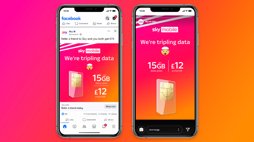
We're tripling data — a bold, vibrant campaign
Bold colour palette
The signature Sky Mobile gradient — magenta, orange, red, pink, and purple stripes — creates immediate visual recognition and energy across all marketing touchpoints.
Playful messaging
"We're tripling data" paired with celebratory emojis and SIM card iconography makes complex telecom offers feel accessible and exciting to mainstream audiences.
Multi-channel consistency
Facebook ads, Instagram stories, and in-app messaging all share the same visual language, reinforcing the campaign message across user journeys.
02 — App Interface Design
Making mobile plans simple and intuitive
Data Usage & Plan Management
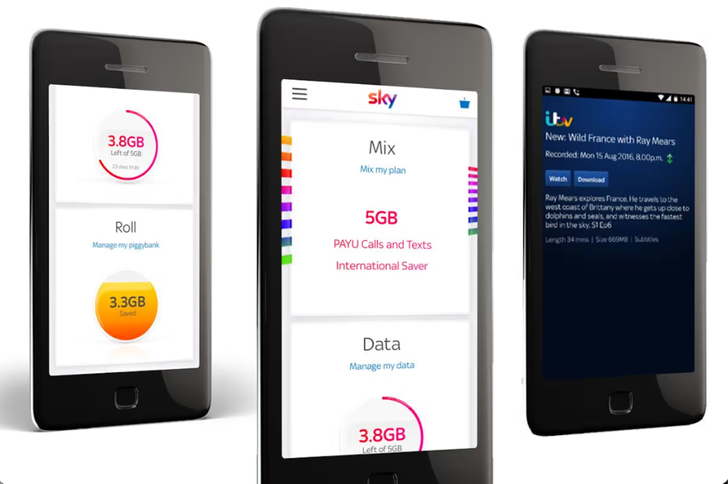
Circular data visualisations show at-a-glance usage, combined with clear plan information and actionable CTAs for upgrades. The magenta accent colour draws attention to key interactions.
Plan Details & Offers
A structured card-based layout breaks down plan components (data, calls, texts, international saver) with colour-coded sections for quick scanning and decision-making.
Data visualisation
Circular progress indicators and colour-coded rings make abstract data consumption (3.8GB used of 5GB) tangible and easy to understand at a glance.
Clear hierarchy
Primary actions ("Manage my plan", "Upgrade") are visually prioritised with magenta buttons, while secondary options ("View details") use lighter styling.
Consistent typography
A clean sans-serif hierarchy with large, readable body text ensures accessibility on small screens whilst maintaining the premium Sky brand aesthetic.
03 — Design System & Brand
A cohesive visual language across all touchpoints
Sky Mobile's design system unifies the bold rainbow brand identity across iOS, Android, and desktop — ensuring every component, colour, and interaction feels unmistakably Sky.
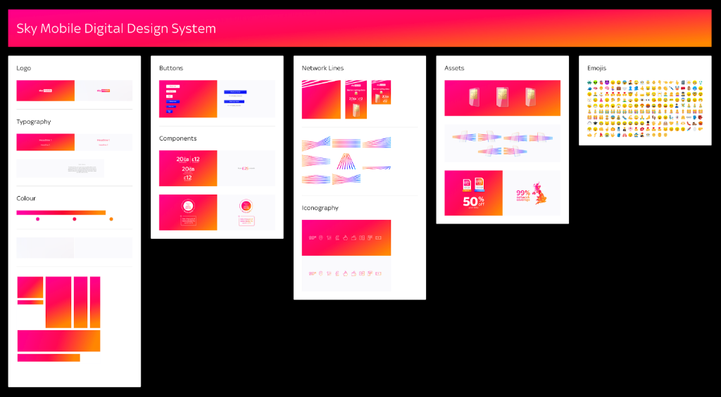
Colour Palette
Sky Magenta
#E0006E
Primary brand colour — CTAs, active states, data ring highlights, key interactions
Sky Orange
#FF6B35
Campaign gradient — social ads, promotional banners, hero backgrounds
Sky Purple
#7B2D8B
Rainbow gradient endpoint — brand illustrations, icon system accents
Sky Pink
#FF69B4
Mid-gradient tone — campaign visuals, celebration states, loading indicators
Sky White
#FFFFFF
Primary content surface — card backgrounds, form inputs, product panels
Dark Slate
#1A1A2A
Dark mode backgrounds, header overlays, footer surfaces
Text Primary
#1C1C1E
Body copy, plan names, pricing figures, product titles
Text Secondary
#6E6E78
Labels, hints, metadata, secondary plan details
Typography Scale
48px / 700w
Display / Hero
Campaign headlines — 'We're tripling data', hero page titles
32px / 600w
Heading 1
Section headers — 'Find your perfect phone', 'Your plan'
22px / 600w
Heading 2
Card headings, plan names, product titles
16px / 400w
Body
Plan descriptions, onboarding copy, product details
12px / 500w
Label / Badge
Filter tags, plan feature bullets, step labels
28px / 700w
Price
Monthly pricing figures — dominant anchor in product and plan cards
Core Components
Data Usage Ring
Circular progress indicator showing GB used vs plan allowance. Colour shifts from magenta to amber as usage approaches the limit — giving instant, accessible at-a-glance feedback.
Plan Card
Structured card breaking down included features (data, calls, texts, international) with colour-coded sections and a primary magenta CTA for upgrade or selection.
Phone Product Card
Grid tile with hero device image, colour swatch selector, social proof badge, and monthly price — all visible without opening the product detail page.
Progress Stepper
5-step horizontal checkout indicator (Phone → Data Plan → Accessories → Protect → Checkout) with green tick completion states and a back-navigation affordance.
Brand Filter Pill
Horizontally scrollable filter row with brand logo pills (Apple, Samsung, Google, Fairphone). Active state uses magenta background; tap toggles single-select behaviour.
Promotional Banner
Full-width contextual offer strip surfaced at key decision points in the checkout — e.g. '50GB for £10/mo'. Dismissible but persistent within the session to drive upsell.
Summary
Overview
A digital transformation programme redesigning Sky Mobile's app and ecommerce platform to simplify account management, plan discovery, and checkout for 8M+ users.
Challenge
Sky Mobile customers struggled to understand complex mobile tariffs, track data usage, and navigate upgrade options across fragmented app and desktop experiences.
Solution
Designed a cohesive iOS/Android app with data visualisations, clear plan information, and streamlined checkout, plus a responsive desktop ecommerce platform—increasing engagement by 32% and app rating to 4.6★.
Key Results
04 — User Testing
Real customer validation — testing plan comprehension and checkout confidence
Testing spanned both the iOS app and desktop ecommerce platform, recruiting Sky Mobile customers across age groups and digital confidence levels. Key focus areas were data usage comprehension, plan upgrade clarity, and checkout drop-off reduction across the 5-step flow.
In-home app observation sessions
Participants used the Sky Mobile app on their own handsets in their own environment — revealing how the circular data usage ring performed in real lighting conditions, and whether plan details were understood without assistance. Sessions were recorded via screen capture with verbal consent.
Checkout A/B prototype testing
Two checkout flow variants were tested via Principle-animated prototypes — Variant A (accessories after plan selection) vs Variant B (accessories as a standalone step). Participants completed a full purchase flow on desktop, with error recovery and back-navigation tracked throughout.
Competitor benchmarking sessions
Participants were shown the redesigned Sky Mobile ecommerce experience alongside the previous version and a leading competitor. Side-by-side preference tests measured clarity of pricing, trust, and ease of plan comparison — informing layout and information hierarchy decisions.
Key Outcomes
32%
engagement increase following data ring redesign — validated through A/B analytics post-launch
4.6★
App Store rating achieved — up from 3.8★ — driven by plan clarity and usage visualisation improvements
Variant B
checkout structure adopted — accessories as a dedicated step increased attachment rate by 66%
"What's Piggybank?"
was the most common question — feature explanation card added, reducing support contacts significantly
Brand filters
reduced time-to-selection on phone listing page by 41% — validated through prototype timing sessions
Methodology
05 — Ecommerce Phone Discovery
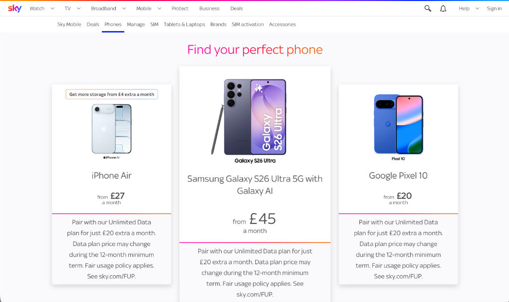
Browsing and selecting the perfect phone
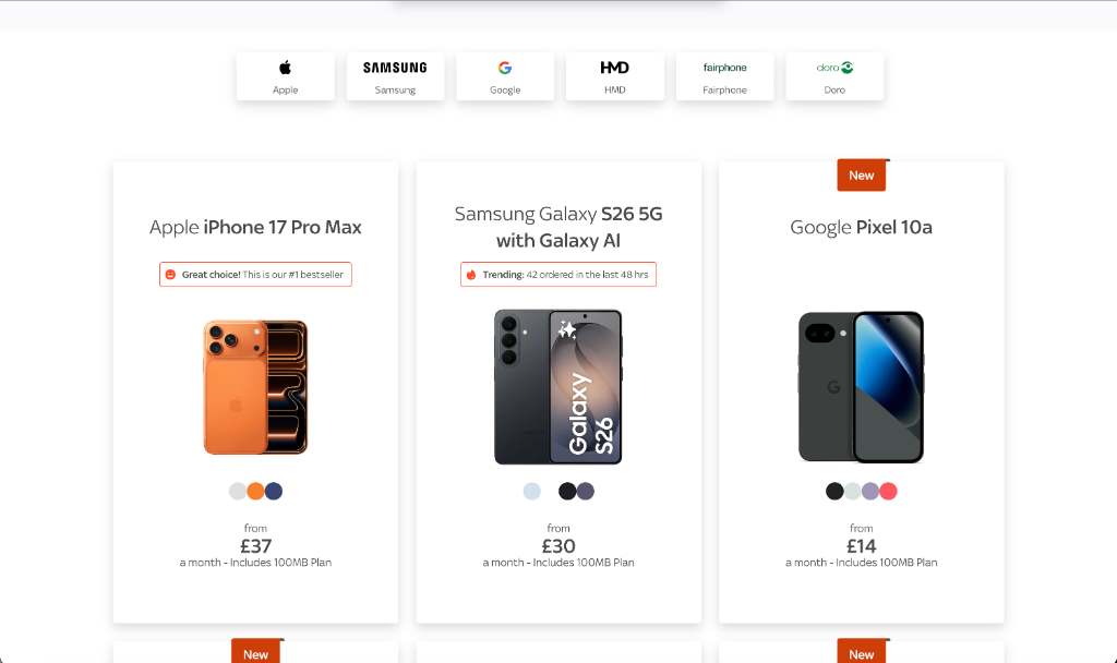
Brand filter navigation
Quick-access brand filters (Apple, Samsung, Google, HMD, Fairphone, Doro) let users narrow the catalogue instantly, reducing decision fatigue across a large product range.
Social proof badges
'Great choice! This is our #1 bestseller' and 'Trending: 42 ordered in the last 48 hrs' badges create urgency and guide indecisive shoppers toward confident purchase decisions.
Clear pricing cards
Each phone card shows device name, hero image, colour variants, and monthly price — giving users all the information they need at a glance without opening a product page.
06 — Product Detail & Checkout Flow
A guided 5-step checkout reducing drop-off
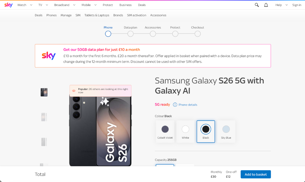
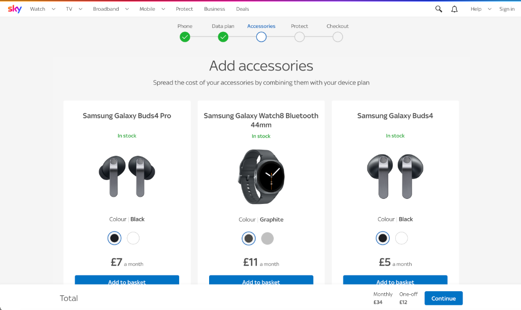
Progress stepper
A 5-step flow (Phone → Data Plan → Accessories → Protect → Checkout) with green completion indicators keeps users oriented and reduces abandonment at each stage.
Contextual promotions
Highlighted banners (e.g. 'Get our 50GB data plan for just £10 a month') surface relevant upsells at the right moment in the journey without interrupting the primary flow.
Accessories upsell
A dedicated accessories step spreads add-on costs across the monthly plan (Buds4 Pro £7/mo, Galaxy Watch8 £11/mo), making premium accessories feel affordable alongside the device.
"Chris delivered a complete digital transformation that modernised our app and ecommerce platform. The design system ensures consistency across all touchpoints. It's improved user retention and made our team's workflow significantly more efficient."
Andrew Watson
VP Digital Products, Sky Mobile