Social Feed App
Atelier
Gallery-First Social for Interior Designers & Set Stylists
Overview
A gallery-first social platform designed exclusively for interior designers and set stylists — where the work is always the hero and the interface disappears.
Atelier was designed from the ground up for visual professionals who find mainstream social platforms too noisy, too algorithmic, and too hostile to high-fidelity imagery. The brief was simple: build a feed that feels like a beautifully curated editorial magazine — where every interaction is intentional, every transition is considered, and the UI serves the work rather than competing with it. The result is a minimal, full-bleed social platform with portfolio-grade image presentation, refined discovery mechanics, and a follow/save architecture built around creative projects rather than individual posts.
Role
Lead UX/UI Designer
Platform
iOS & Android App
Sector
Creative Professional Tools
Tools
Figma, FigJam, Principle, Maze
Team
PM, Designer, UX Researcher
Impact
0%
UI chrome in full-bleed view
4
Core Navigation Gestures
3s
Target Feed Load Time
∞
Scroll — no pagination
01 — Gallery Feed
Full-bleed, edge-to-edge imagery — no distractions
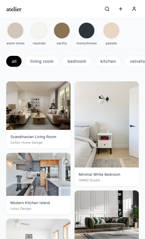
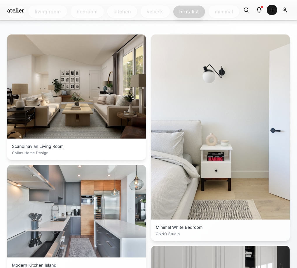
The feed is built around a masonry-style variable grid that adapts image ratios rather than forcing crops. Images breathe. Metadata is hidden by default and revealed on a long-press — keeping the visual experience uninterrupted.
Adaptive masonry grid
Images are never cropped or letterboxed. The grid reflows around native aspect ratios — portrait editorial shots sit beside square flatlays without visual tension.
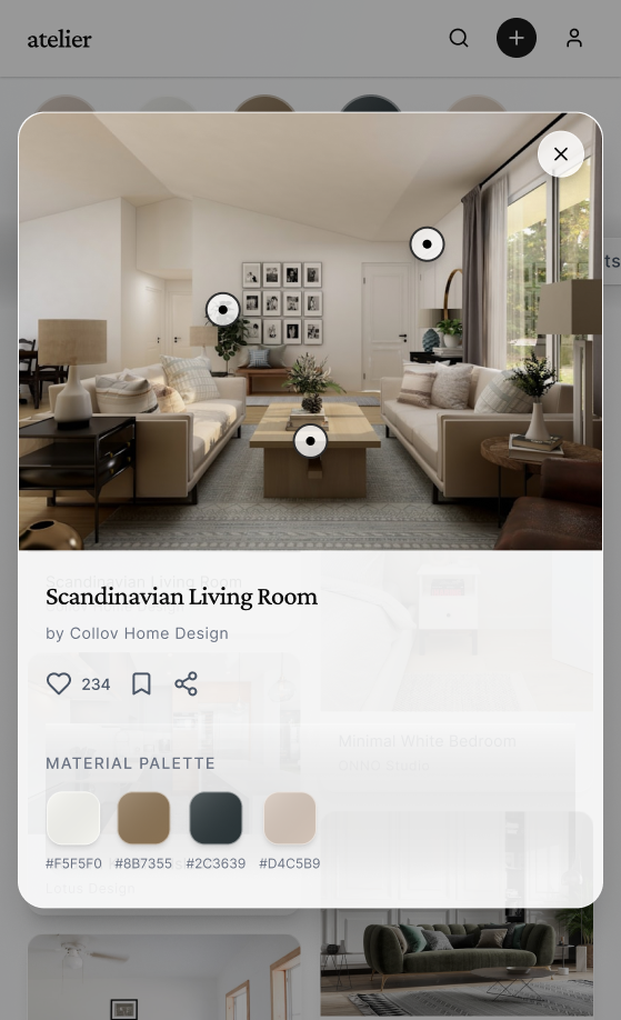
Long-press metadata reveal
Designer name, project title, room type tag, and save count appear as a subtle overlay on long-press — keeping the feed clean while surfacing essential context on demand.
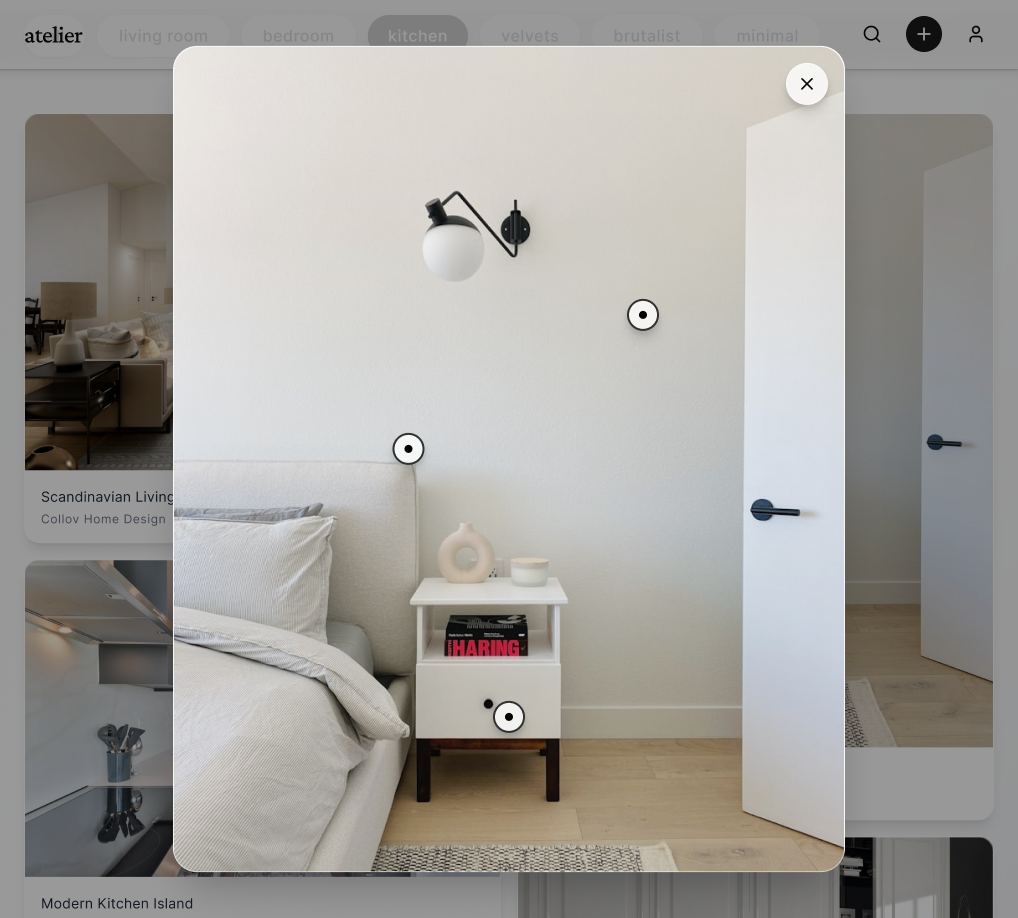
Haptic save gesture
A double-tap anywhere on an image saves it to the user's active board, confirmed with a micro haptic pulse and a soft bloom animation — no button required.
02 — Designer Profile & Portfolio
Profiles built around projects, not individual posts
Rather than a chronological post history, each designer's profile is structured around named projects — a living room commission, a film set, a brand shoot. Posts are grouped into these projects, allowing visitors to experience the full creative arc of a piece of work rather than isolated images.
Project-grouped portfolio with cover image and title card
Specialisms displayed as minimal text tags — Interior, Set Design, Commercial, Residential
Follower / Following counts de-emphasised — work quality drives discovery
Availability status — Open to commissions / Currently unavailable
Location, studio name, and website link in a single meta line
03 — Discovery & Search
Mood-driven discovery — not algorithm-driven engagement
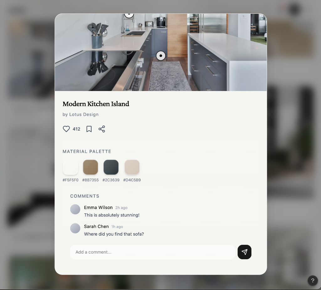
Discovery is structured around visual moods and material palettes rather than trending hashtags. Users browse by curated aesthetic families — Wabi-Sabi, Brutalist, Japandi, Maximalist — each presented as a full-bleed editorial spread, not a tag cloud.
Aesthetic family pages
Each aesthetic family — Japandi, Wabi-Sabi, Coastal, Brutalist, Maximalist — has a dedicated editorial spread with a mood description, palette strip, and curated posts. Browsable like a magazine section.
Material & palette search
Search by material (travertine, rattan, fluted glass, terrazzo) or palette (warm neutrals, moody darks, dusty pastels) returns a filtered feed — not a list of text results.
Collections by editors
A small team of editorial curators maintain themed collections — 'Spring Sets 2026', 'Awards Shortlist' — surfaced as featured boards within discovery, distinct from algorithmic recommendations.
04 — Upload & Post Creation
An upload flow that respects the image
The post creation flow was designed to feel more like publishing than posting. Designers select or photograph their work, assign it to an existing project or create a new one, and add optional metadata — credits, materials, room type — before a final full-bleed preview before publishing.
Multi-image upload — up to 12 per post, any native aspect ratio
Assign to project or create new — project title, cover selection
Optional credits — photographer, architect, stylist, brand
Material tags drawn from a structured taxonomy (not freeform hashtags)
Full-bleed preview before publish — 'this is how your audience sees it'
Scheduling — publish now or set a future date/time
Summary
Overview
A gallery-first social platform for interior designers and set stylists — where full-bleed imagery, project-grouped portfolios, and mood-driven discovery replace engagement metrics and algorithmic noise.
Challenge
Visual professionals found existing platforms hostile to their work — image compression, algorithmic anxiety, isolated posts with no project context, and interfaces designed for engagement theatre rather than creative expression.
Solution
Designed a minimal, editorial-grade social app with adaptive masonry feed, project-based profile architecture, material-taxonomy search, and client-shareable mood boards — reducing cognitive load and centering the work.
Key Results
05 — User Testing
Tested with interior designers, set stylists, and creative directors across London and New York
Research sessions recruited working interior designers (independent and studio-based), set stylists, and creative directors who currently use Instagram, Pinterest, or Behance as their primary visual platform. Sessions focused on feed navigation, post creation, board management, and discovery flows.
Contextual intercept interviews
Participants were interviewed in their studios while using their current primary platform — Instagram or Pinterest — before being shown Curation prototypes. This contextual approach surfaced organic frustrations (algorithm anxiety, image compression, engagement theatre) that informed the core product positioning and feature prioritisation.
Maze unmoderated prototype testing
Core flows — feed navigation, double-tap save, post creation, and board sharing — were deployed via Maze to 30 participants. Heatmaps revealed that the long-press metadata reveal was discovered by only 38% of participants without prompting, leading to an onboarding tooltip that surfaces the gesture on first feed interaction.
A/B grid layout testing
Two feed grid variants were tested — a strict two-column equal grid vs. the adaptive masonry approach. 84% of participants rated the masonry feed as 'more premium' and 'like a real magazine'. The equal grid was described as 'Instagram but slower', validating the masonry approach as the production direction.
Key Outcomes
84%
preferred masonry feed over equal grid — described as 'more premium, like a real magazine'
38%
long-press discovery rate without prompting — resolved with first-session onboarding gesture hint
3×
higher board creation rate vs. save-to-favourites — project grouping resonated strongly
"No crops"
was the single most-mentioned positive — native aspect ratio preservation rated as a top-3 feature
Post creation
target of under 90 seconds end-to-end achieved after removing mandatory caption requirement
Methodology
Design System
A near-invisible UI — warm neutrals, editorial type, zero decoration
The design language is deliberately restrained — warm off-whites, deep charcoal, and a single warm accent drawn from aged parchment. Every typographic decision favours editorial refinement over digital convention.
Colour Palette
Paper
#F5F2EE
Primary background — warm off-white, never pure white
Charcoal
#1A1A18
Primary text, navigation icons, primary actions
Warm Ash
#8C8680
Secondary text, metadata, timestamps, hint copy
Parchment
#C8B99A
Accent — save confirmations, active states, highlights
Canvas
#EDE9E3
Card surfaces, input backgrounds, dividers
Fog
#D4CFC8
Borders, separators, inactive tab indicators
Deep Night
#0F0F0D
Full-bleed image view background — near-black
White
#FFFFFF
Overlay text on dark imagery, modal surfaces
Typography
32px / 300w
Display / Project Title
Profile names, project titles, editorial feature headings — light weight for refined feel
15px / 400w
Body — Regular
Captions, bio text, board descriptions
10px / 500w
Label — Spaced Caps
Category tags, material labels, section eyebrows — 0.15em tracking
20px / 300w
Metric / Count
Follower counts, save counts — light weight keeps them decorative not dominant
13px / 400w
Caption — Italic
Credits, location, studio name — italic to distinguish from primary content
Core Components
Feed Card
A frameless image tile that respects native aspect ratio — no chrome, no border radius on the image itself. Metadata is entirely hidden until long-pressed, keeping the visual field completely clean.
Project Tile
Profile grid item showing a cover image with project title in a fine-weight typeface anchored to the bottom-left. Tap opens a full-screen project view with a horizontal scroll through all images in that project.
Save Bloom
On double-tap save, a soft bloom animation radiates from the touch point in the parchment accent colour — no icon, just a gentle pulse. Confirmed by a single haptic tap.
Aesthetic Tag
Minimal all-caps text tag in spaced tracking — no pill shape, no fill, no border. Tags are separated by thin · dividers and feel like editorial categorisation rather than social metadata.
Board Cover Grid
Boards are presented as a 2×2 thumbnail collage of the four most recently saved images, overlaid with the board title in fine-weight type. A single line beneath shows image count and share status.
Upload Preview
Full-screen, edge-to-edge preview of the post before publishing — no interface chrome visible — so the designer sees exactly what their audience will see. A single 'Publish' pill floats at the bottom.
"Finally a platform that gets it — the work is the thing. No engagement metrics screaming at you, no algorithmic punishment for not posting daily. Curation feels like the platform interior design has always deserved."
Isabelle Martens
Senior Interior Designer & Set Stylist, London